I frequently predict proportions (e.g., proportion of year during which a customer is active). This is a regression task because the dependent variables is a float, but the dependent variable is bound between the 0 and 1. Googling around, I had a hard time finding the a good way to model this situation, so I've written here what I think is the most straight forward solution.
Let's get started by importing some libraries for making random data.
 from sklearn.datasets import make_regression
 import numpy as np
Create random regression data.
 rng = np.random.RandomState(0)  # fix random state
 X, y, coef = make_regression(n_samples=10000,
                              n_features=100,
                              n_informative=40,
                              effective_rank= 15,
                              random_state=0,
                              noise=4.0,
                              bias=100.0,
                              coef=True)
Shrink down the dependent variable so it's bound between 0 and 1.
 y_min = min(y)
 y = [i-y_min for i in y]  # min value will be 0
 y_max = max(y)
 y = [i/y_max for i in y]  # max value will be 1
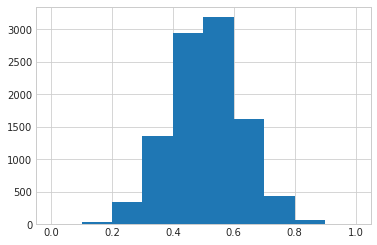
Make a quick plot to confirm that the data is bound between 0 and 1.
 from matplotlib import pyplot as plt
 import seaborn as sns
 %matplotlib inline

 sns.set_style('whitegrid')

 plt.hist(y);
All the data here is fake which worries me, but beggars can't be choosers and this is just a quick example.
Below, I apply a plain GLM to the data. This is what you would expect if you treated this as a plain regression problem
 import statsmodels.api as sm

 linear_glm = sm.GLM(y, X)
 linear_result = linear_glm.fit()
 # print(linear_result.summary2())  # too much output for a blog post
Here's the actual values plotted (x-axis) against the predicted values (y-axis). The model does a decent job, but check out the values on the y-axis - the linear model predicts negative values!
plt.plot(y, linear_result.predict(X), 'o', alpha=0.2);
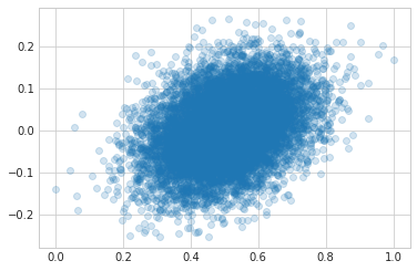
Obviously the linear model above isn't correctly modeling this data since it's guessing values that are impossible.
I followed this tutorial which recommends using a GLM with a logit link and the binomial family. Checking out the statsmodels module reference, we can see the default link for the binomial family is logit.
Below I apply a GLM with a logit link and the binomial family to the data.
 binom_glm = sm.GLM(y, X, family=sm.families.Binomial())
 binom_results = binom_glm.fit()
 #print(binom_results.summary2())  # too much output for a blog post
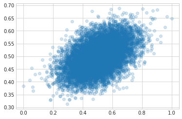
Here's the actual data (x-axis) plotted against teh predicted data. You can see the fit is much better!
plt.plot(y, binom_results.predict(X), 'o', alpha=0.2);
 %load_ext watermark
 %watermark -v -m -p numpy,matplotlib,sklearn,seaborn,statsmodels

CPython 3.6.3
IPython 6.1.0

numpy 1.13.3
matplotlib 2.0.2
sklearn 0.19.1
seaborn 0.8.0
statsmodels 0.8.0

compiler   : GCC 7.2.0
system     : Linux
release    : 4.13.0-38-generic
machine    : x86_64
processor  : x86_64
CPU cores  : 4
interpreter: 64bit