Principal Component Analysis (PCA) is an important method for dimensionality reduction and data cleaning. I have used PCA in the past on this blog for estimating the latent variables that underlie player statistics. For example, I might have two features: average number of offensive rebounds and average number of defensive rebounds. The two features are highly correlated because a latent variable, the player’s rebounding ability, explains common variance in the two features. PCA is a method for extracting these latent variables that explain common variance across features.
In this tutorial I generate fake data in order to help gain insight into the mechanics underlying PCA.
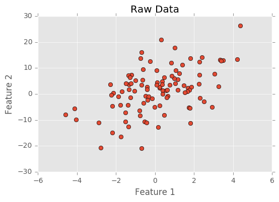
Below I create my first feature by sampling from a normal distribution. I create a second feature by adding a noisy normal distribution to the first feature multiplied by two. Because I generated the data here, I know it’s composed to two latent variables, and PCA should be able to identify these latent variables.
I generate the data and plot it below.
1 2 3 4 5 6 7 8 9 10 11 12 13 14 15 | |
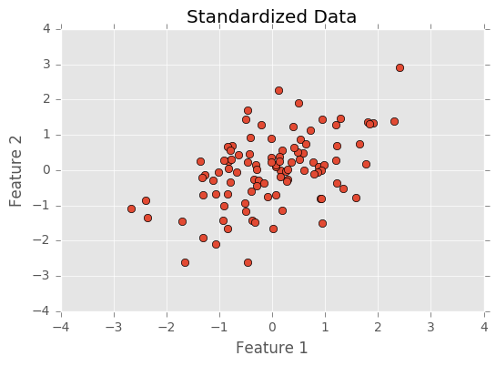
The first step before doing PCA is to normalize the data. This centers each feature (each feature will have a mean of 0) and divides data by its standard deviation (changing the standard deviation to 1). Normalizing the data puts all features on the same scale. Having features on the same scale is important because features might be more or less variable because of measurement rather than the latent variables producing the feature. For example, in basketball, points are often accumulated in sets of 2s and 3s, while rebounds are accumulated one at a time. The nature of basketball puts points and rebounds on a different scales, but this doesn’t mean that the latent variables scoring ability and rebounding ability are more or less variable.
Below I normalize and plot the data.
1 2 3 4 5 6 7 8 9 | |
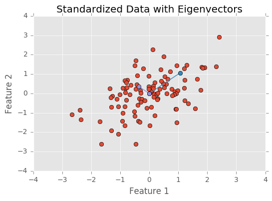
After standardizing the data, I need to find the eigenvectors and eigenvalues. The eigenvectors point in the direction of a component and eigenvalues represent the amount of variance explained by the component. Below, I plot the standardized data with the eigenvectors ploted with their eigenvalues as the vectors distance from the origin.
As you can see, the blue eigenvector is longer and points in the direction with the most variability. The purple eigenvector is shorter and points in the direction with less variability.
As expected, one component explains far more variability than the other component (becaus both my features share variance from a single latent gaussian distribution).
1 2 3 4 5 6 7 8 9 10 | |
Next I order the eigenvectors according to the magnitude of their eigenvalues. This orders the components so that the components that explain more variability occur first. I then transform the data so that they’re axis aligned. This means the first component explain variability on the x-axis and the second component explains variance on the y-axis.
1 2 3 4 5 6 7 8 9 10 11 12 13 | |
![]()
Finally, just to make sure the PCA was done correctly, I will call PCA from the sklearn library, run it, and make sure it produces the same results as my analysis.
1 2 3 4 5 6 7 | |
(-1.0, 0.0)
(-1.0, 0.0)