Traditionally, survival functions have been used in medical research to visualize the proportion of people who remain alive following a treatment. I often use them to understand the length of time between users creating and cancelling their subscription accounts.
Here, I describe how to create a survival function using PySpark. This is not a post about creating a Kaplan-Meier estimator or fitting mathematical functions to survival functions. Instead, I demonstrate how to acquire the data necessary for plotting a survival function.
Next, I load fake data into a Spark Dataframe. This is the data we will use in this example. Each row is a different user and the Dataframe has columns describing start and end dates for each user. start_date represents when a user created their account and end_date represents when a user canceled their account.
I use a Python UDF to create a vector of the numbers 0 through 13 representing our period of interest. The start date of our period of interest is a user’s start_date. The end date of our period of interest is 13 days following a user’s start_date. I chose 13 days as the period of interest for no particular reason.
I use explode to expand the numbers in each vector (i.e., 0->13) into different rows. Each user now has a row for each day in the period of interest.
We want the proportion of users who are active X days after start_date. I create a column active which represents whether users are active or not. I initially assign each user a 1 in each row (1 represents active). I then overwrite 1s with 0s after a user is no longer active. I determine that a user is no longer active by comparing the values in day and days_till_cancel. When day is greater than days_till_cancel, the user is no longer active.
Finally, to acquire the survival function data, I group by day (days following start_date) and average the value in active. This provides us with the proportion of users who are active X days after start_date.
I recently gave a presentation at Venture Cafe describing how I see automation changing python, machine-learning workflows in the near future.
In this post, I highlight the presentation’s main points. You can find the slides here.
From Ray Kurzweil’s excitement about a technological singularity to Elon Musk’s warnings about an A.I. Apocalypse, automated machine-learning evokes strong feelings. Neither of these futures will be true in the near-term, but where will automation fit in your machine-learning workflows?
Our existing machine-learning workflows might look a little like the following (please forgive the drastic oversimplification of a purely sequential progression across stages!).
Where does automation exist in this workflow? Where can automation improve this workflow?
Not all these stages are within the scope of machine-learning. For instance, while you should automate gathering data, I view this as a data engineering problem. In the image below, I depict the stages that I consider ripe for automation, and the stages I consider wrong for automation. For example, data cleaning is too idiosyncratic to each dataset for true automation. I “X” out model evaluation as wrong for automation. In retrospect, I believe this is a great place for automation, but I don’t know of any existing python packages handling it.
I depict feature engineering and model selection as the most promising areas for automation. I consider feature engineering as the stage where advances in automation can have the largest impact on your model performance. In the presentation, I include a strong quote from a Quora user saying that hyper-parameter tuning (a part of model selection) “hardly matters at all.” I agree with the sentiment of this quote, but it’s not true. Choosing roughly the correct hyper-parameter values is VERY important, and choosing the very best hyper-parameter values can be equally important depending on how your model is used. I highlight feature engineering over model selection because automated model selection is largely solved. For example grid-search automates model selection. It’s not a fast solution, but given infinite time, it will find the best hyper-parameter values!
There are many python libraries automating these parts of the workflow. I highlight three libraries that automate feature engineering.
The first is teapot. Teapot (more or less) takes all the different operations and models available in scikit-learn, and allows you to assemble these operations into a pipeline. Many of these operations (e.g., PCA) are forms of feature engineering. Teapot measures which operations lead to the best model performance. Because Teapot enables users to assemble SO MANY different operations, it utilizes a genetic search algorithm to search through the different possibilities more efficiently than grid-search would.
The third is feature tools. Feature Tools is the piece of automation software whose future I am most excited about. I find this software exciting because users can feed it pre-aggregated data. Most machine-learning models expect that for each value of the response variable, you supply a vector of explanatory variables. This is an example of aggregated data. Teapot and auto_ml both expect users to supply aggregated data. Lots of important information is lost in the aggregation process, and allowing automation to thoroughly explore different aggregations will lead to predictive features that we would not have created otherwise (any many believe this is why deep learning is so effective). Feature tools explores different aggregations all while creating easily interpreted variables (in contrast to deep learning). While I am excited about the future of feature tools, it is a new piece of software and has a ways to go before I use it in my workflows. Like most automation machine-learning software it’s very slow/resource intensive. Also, the software is not very intuitive. That said, I created a binder notebook demoing feature tools, so check it out yourself!
We should always keep in mind the possible dangers of automation and machine-learning. Removing humans from decisions accentuates biases baked into data and algorithms. These accentuated biases can have dangerous effects. We should carefully choose which decisions we’re comfortable automating and what safeguards to build around these decisions. Check out Cathy O’Neil’s amazing Weapons for Math Destruction for an excellent treatment of the topic.
This post makes no attempt to give an exhaustive view of automated machine-learning. This is my single view point on where I think automated machine-learning can have an impact on your python workflows in the near-term. For a more thorough view of automated machine-learning, check out this presentation by Randy Olson (the creator of teapot).
PySpark has a great set of aggregate functions (e.g., count, countDistinct, min, max, avg, sum), but these are not enough for all cases (particularly if you’re trying to avoid costly Shuffle operations).
PySpark currently has pandas_udfs, which can create custom aggregators, but you can only “apply” one pandas_udf at a time. If you want to use more than one, you’ll have to preform multiple groupBys…and there goes avoiding those shuffles.
In this post I describe a little hack which enables you to create simple python UDFs which act on aggregated data (this functionality is only supposed to exist in Scala!).
I then create a UDF which will count all the occurences of the letter ‘a’ in these lists (this can be easily done without a UDF but you get the point). This UDF wraps around collect_list, so it acts on the output of collect_list.
1234567891011
deffind_a(x):"""Count 'a's in list."""output_count=0foriinx:ifi=='a':output_count+=1returnoutput_countfind_a_udf=F.udf(find_a,T.IntegerType())a.groupBy('id').agg(find_a_udf(F.collect_list('value')).alias('a_count')).show()
id
a_count
1
1
2
0
There we go! A UDF that acts on aggregated data! Next, I show the power of this approach when combined with when which let’s us control which data enters F.collect_list.
First, let’s create a dataframe with an extra column.
Apache Airflow is great for coordinating automated jobs, and it provides a simple interface for sending email alerts when these jobs fail. Typically, one can request these emails by setting email_on_failure to True in your operators.
These email alerts work great, but I wanted to include additional links in them (I wanted to include a link to my spark cluster which can be grabbed from the Databricks Operator). Here’s how I created a custom email alert on job failure.
First, I set email_on_failure to False and use the operators’s on_failure_callback. I give on_failure_callback the function described below.
12345678910111213141516171819
fromairflow.utils.emailimportsend_emaildefnotify_email(contextDict,**kwargs):"""Send custom email alerts."""# email title.title="Airflow alert: {task_name} Failed".format(**contextDict)# email contentsbody=""" Hi Everyone, <br> <br> There's been an error in the {task_name} job.<br> <br> Forever yours,<br> Airflow bot <br> """.format(**contextDict)send_email('[email protected]',title,body)
send_email is a function imported from Airflow. contextDict is a dictionary given to the callback function on error. Importantly, contextDict contains lots of relevant information. This includes the Task Instance (key=’ti’) and Operator Instance (key=’task’) associated with your error. I was able to use the Operator Instance, to grab the relevant cluster’s address and I included this address in my email (this exact code is not present here).
To use the notify_email, I set on_failure_callback equal to notify_email.
I write out a short example airflow dag below.
12345678910111213141516171819202122
fromairflow.modelsimportDAGfromairflow.operatorsimportPythonOperatorfromairflow.utils.datesimportdays_agoargs={'owner':'me','description':'my_example','start_date':days_ago(1)}# run every day at 12:05 UTCdag=DAG(dag_id='example_dag',default_args=args,schedule_interval='0 5 * * *')defprint_hello():return'hello!'py_task=PythonOperator(task_id='example',python_callable=print_hello,on_failure_callback=notify_email,dag=dag)py_task
Note where set on_failure_callback equal to notify_email in the PythonOperator.
Hope you find this helpful! Don’t hesitate to reach out if you have a question.
Many (if not all of) PySpark’s machine learning algorithms require the input data is concatenated into a single column (using the vector assembler command). This is all well and good, but applying non-machine learning algorithms (e.g., any aggregations) to data in this format can be a real pain. Here, I describe how to aggregate (average in this case) data in sparse and dense vectors.
I start by importing the necessary libraries and creating a spark dataframe, which includes a column of sparse vectors. Note that I am using ml.linalg SparseVector and not the SparseVector from mllib. This makes a big difference!
123456789101112
frompyspark.sqlimportfunctionsasFfrompyspark.sqlimporttypesasTfrompyspark.ml.linalgimportSparseVector,DenseVector# note that using Sparse and Dense Vectors from ml.linalg. There are other Sparse/Dense vectors in spark.df=sc.parallelize([(1,SparseVector(10,{1:1.0,2:1.0,3:2.0,4:1.0,5:3.0})),(2,SparseVector(10,{9:100.0})),(3,SparseVector(10,{1:1.0})),]).toDF(["row_num","features"])df.show()
row_num
features
1
(10,[1,2,3,4,5],[1.0, 1.0, 2.0, 1.0, 3.0])
2
(10,[9],[100.0])
3
(10,[1],[1.0])
Next, I write a udf, which changes the sparse vector into a dense vector and then changes the dense vector into a python list. The python list is then turned into a spark array when it comes out of the udf.
Cron is great for automation, but when tasks begin to rely on each other (task C can only run after both tasks A and B finish) cron does not do the trick.
Apache Airflow is open source software (from airbnb) designed to handle the relationship between tasks. I recently setup an airflow server which coordinates automated jobs on databricks (great software for coordinating spark clusters). Connecting databricks and airflow ended up being a little trickier than it should have been, so I am writing this blog post as a resource to anyone else who attempts to do the same in the future.
For the most part I followed this tutorial from A-R-G-O when setting up airflow. Databricks also has a decent tutorial on setting up airflow. The difficulty here is that the airflow software for talking to databricks clusters (DatabricksSubmitRunOperator) was not introduced into airflow until version 1.9 and the A-R-G-O tutorial uses airflow 1.8.
Airflow 1.9 uses Celery version >= 4.0 (I ended up using Celery version 4.1.1). Airflow 1.8 requires Celery < 4.0. In fact, the A-R-G-O tutorial notes that using Celery >= 4.0 will result in the error:
1
airflow worker: Received and deleted unknown message. Wrong destination?!?
I can attest that this is true! If you use airflow 1.9 with Celery < 4.0, everything might appear to work, but airflow will randomly stop scheduling jobs after awhile (check the airflow-scheduler logs if you run into this). You need to use Celery >= 4.0! Preventing the Wrong destination error is easy, but the fix is hard to find (hence why I wrote this post).
After much ado, here’s the fix! If you follow the A-R-G-O tutorial, install airflow 1.9, celery >=4.0 AND set broker_url in airflow.cfg as follows:
I constantly use google calendar to schedule reminder emails, but I want some of my reminders to be stochastic!
Google calendar wants all their events to occur on a regular basis (e.g., every Sunday), but I might want a weekly reminder email which occurs on a random day each the week.
I wrote a quick set of python scripts which handle this situation.
The script find_days.py chooses a random day each week (over a month) on which a reminder email should be sent. These dates are piped to a text file (dates.txt). The script send_email.py reads this text file and sends a reminder email to me if the current date matches one of the dates in dates.txt.
I use cron to automatically run these scripts on a regular basis. Cron runs find_days.py on the first of each month and runs send_email.py every day. I copied my cron script as cron_job.txt.
I use mailutils and postfix to send the reminder emails from the machine. Check out this tutorial for how to set up a send only mail server. The trickiest part of this process was repeatedly telling gmail that my emails were not spam.
Now I receive my weekly reminder on an unknown date so I can act spontaneous!
I frequently predict proportions (e.g., proportion of year during which a customer is active). This is a regression task because the dependent variables is a float, but the dependent variable is bound between the 0 and 1. Googling around, I had a hard time finding the a good way to model this situation, so I’ve written here what I think is the most straight forward solution.
I am guessing there’s a better way to do this with MCMC, so please comment below if you know a better way.
Let’s get started by importing some libraries for making random data.
rng=np.random.RandomState(0)# fix random stateX,y,coef=make_regression(n_samples=10000,n_features=100,n_informative=40,effective_rank=15,random_state=0,noise=4.0,bias=100.0,coef=True)
Shrink down the dependent variable so it’s bound between 0 and 1.
1234
y_min=min(y)y=[i-y_minforiiny]# min value will be 0y_max=max(y)y=[i/y_maxforiiny]# max value will be 1
Make a quick plot to confirm that the data is bound between 0 and 1.
All the data here is fake which worries me, but beggars can’t be choosers and this is just a quick example.
Below, I apply a plain GLM to the data. This is what you would expect if you treated this as a plain regression problem
12345
importstatsmodels.apiassmlinear_glm=sm.GLM(y,X)linear_result=linear_glm.fit()# print(linear_result.summary2()) # too much output for a blog post
Here’s the actual values plotted (x-axis) against the predicted values (y-axis). The model does a decent job, but check out the values on the y-axis - the linear model predicts negative values!
Obviously the linear model above isn’t correctly modeling this data since it’s guessing values that are impossible.
I followed this tutorial which recommends using a GLM with a logit link and the binomial family. Checking out the statsmodels module reference, we can see the default link for the binomial family is logit.
Below I apply a GLM with a logit link and the binomial family to the data.
123
binom_glm=sm.GLM(y,X,family=sm.families.Binomial())binom_results=binom_glm.fit()#print(binom_results.summary2()) # too much output for a blog post
Here’s the actual data (x-axis) plotted against teh predicted data. You can see the fit is much better!
I’ve always found ROC curves a little confusing. Particularly when it comes to ROC curves with imbalanced classes. This blog post is an exploration into receiver operating characteristic (i.e. ROC) curves and how they react to imbalanced classes.
defgrab_probability(sample_size):"""Draw probabilties"""returnnp.random.random(size=(sample_size,))defcreate_fake_binary_data(positive,sample_size):"""Create a vector of binary data with the mean specified in positive"""negative=1-positivey=np.ones(sample_size)y[:int(negative*sample_size)]=0np.random.shuffle(y)returnydefprobability_hist(probs):"""Create histogram of probabilities"""fig=plt.Figure()weights=np.ones_like(probs)/float(len(probs))plt.hist(probs,weights=weights)plt.xlim(0,1)plt.ylim(0,1);defplot_roc_curve(fpr,tpr,roc_auc,lw=2):"""Plot roc curve"""lw=lwfig=plt.Figure()plt.plot(fpr,tpr,color='darkorange',lw=lw,label='ROC curve (area = %0.2f)'%roc_auc)plt.plot([0,1],[0,1],color='navy',lw=2,linestyle='--')plt.xlim([0.0,1.0])plt.ylim([0.0,1.05])plt.xlabel('False Positive Rate')plt.ylabel('True Positive Rate')plt.title('Receiver operating characteristic example')plt.legend(loc="lower right");
I have found one of the best ways to learn about an algorithm is to give it fake data. That way, I know the data, and can examine exactly what the algorithm does with the data. I then change the data and examine how the algorithm reacts to this change.
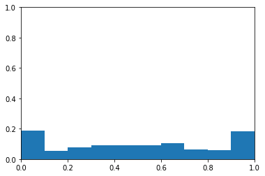
The first dataset I create is random data with balanced classes.
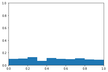
I create probability with the grab_probability function. This is a vector of numbers between 0 and 1. These data are meant to simulate the probabilities that would be produced by a model that is no better than chance.
I also create the vector y which is random ones and zeroes. I will call the ones the positive class and the zeroes the negative class.
The plot below is a histogram of probability. The y-axis is the proportion of samples in each bin. The x-axis is probability levels. You can see the probabilities appear to be from a uniform distribution.
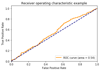
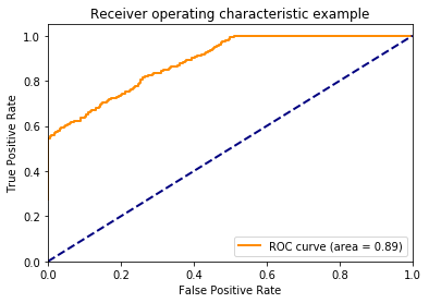
There’s no association between y and the probability, so I don’t expect the area under the curve to be different than chance (i.e., have an area under the curve of about 0.5). I plot the ROC curve to confirm this below.
Let’s talk about the axes here. The y-axis is the proportion of true positives (i.e., TPR - True Positive Rate). This is how often the model correctly identifies members of the positive class. The x-axis is the proportion of false positives (FPR - False Positive Rate). This how often the model incorrectly assigns examples to the positive class.
One might wonder how the TPR and FPR can change. Doesn’t a model always produce the same guesses? The TPR and FPR can change because we can choose how liberal or conservative the model should be with assigning examples to the positive class. The lower left-hand corner of the plot above is when the model is maximally conservative (and assigns no examples to the positive class). The upper right-hand corner is when the model is maximally liberal and assigns every example to the positive class.
I used to assume that when a model is neutral in assigning examples to the positive class, that point would like halfway between the end points, but this is not the case. The threshold creates points along the curve, but doesn’t dictate where these points lie. If this is confusing, continue to think about it as we march through the proceeding plots.
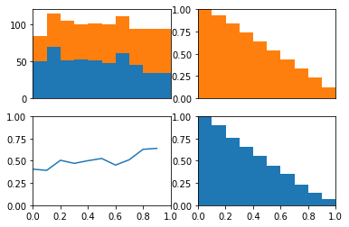
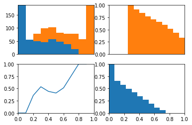
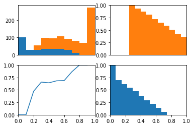
The ROC curve is the balance between true and false positives as a threshold varies. To help visualize this balance, I create a function which plots the two classes as a stacked histogram, cumulative density functions, and the relative balance between the two classes.
The idea behind this plot is we can visualize the model’s threshold moving from LEFT to RIGHT through the plots. As the threshold decreases, the model will guess the positive class more often. This means more and more of each class will be included when calculating the numerator of TPR and FPR.
The top left plot is a stacked histogram. Orange depicts members of the positive class and blue depicts members of the negative class. On the x-axis (of all four plots) is probability.
If we continue thinking about the threshold as decreasing as the plots moves from left to right, we can think of the top right plot (a reversed CDF of the positive class) as depicting the proportion of the positive class assigned to the positive class as the threshold varies (setting the TPR). We can think of the bottom right plot (a reversed CDF of the negative class) as depicting the proportion of the negative class assigned to the positive class as the threshold varies (setting the FPR).
In the bottom left plot, I plot the proportion of positive class that falls in each bin from the histogram in the top plot. Because the proportion of positive and negative class are equal as the threshold varies (as depicted in the bottom plot) we consistently assign both positive and negative examples to the positive class at equal rates and the ROC stays along the identity and the area under the curve is 0.5.
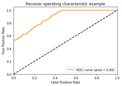
Next, I do the same process as above but with fake probabilities that are predictive of the label. The function biased_probability produces probabilities that tend to be greater for the positive class and lesser for the negative class.
1234567
defbiased_probability(y):"""Return probabilities biased towards correct answer"""probability=np.random.random(size=(len(y),))probability[y==1]=np.random.random(size=(int(sum(y)),))+0.25probability[y==0]=np.random.random(size=(int(sum(y==0)),))-0.25probability=np.array([max(0,min(1,i))foriinprobability])returnprobability
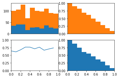
I create this data for a balanced class problem again. using the same y vector, I adjust the probabilities so that they are predcitive of the values in this y vector. Below, you can see the probability data as a histogram. The data no longer appear to be drawn from a uniform distribution. Instead, there are modes near 0 and 1.
Now, we get a nice roc curve which leaves the identity line. Not surprising since I designed the probabilities to be predictive. Notice how quickly the model acheives a TPR of 1. Remember this when looking at the plots below.
In the upper left plot below, we can clearly see that the positive class occurs more often than the negative class on the right side of the plot.
Now remember that the lower left hand side of the roc plot is when we are most conservative. This corresponds to the right hand side of these plots where the model is confident that these examples are from the positive class.
If we look at the cdfs of right side. We can see the positive class (in orange) has many examples on the right side of these plots while the negative class (in blue) has no examples on this side. This is why the TPR immediately jumps to about 0.5 in the roc curve above. We also see the positive class has no examples on the left side of these plots while the negative class has many. This is why the TPR saturates at 1 well before the FPR does.
In other words, because there model is quite certain that some examples are from the positive class the ROC curve quickly jumps up on the y-axis. Because the model is quite certain as to which examples are from the negative class, the ROC curves saturates on the y-axis well before the end of the x-axis.
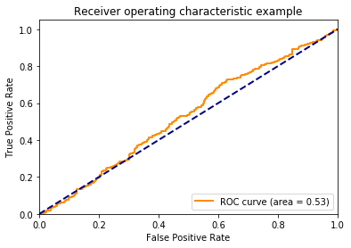
After those two examples, I think we have a good handle on the ROC curve in the balanced class situation. Now let’s make some fake data when the classes are unbalanced. The probabilities will be completely random.
12345678910
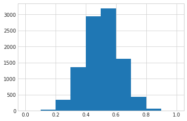
sample_size=1000positive=0.7y=create_fake_binary_data(positive,sample_size)probability=grab_probability(sample_size)print('Average Test Value: %0.2f'%np.mean(y))print('Average Probability: %0.2f'%np.mean(probability))probability_hist(probability)
Average Test Value: 0.70
Average Probability: 0.49
Again, this is fake data, so the probabilities do not reflect the fact that the classes are imbalanced.
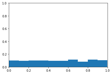
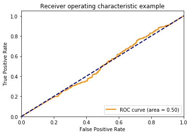
Below, we can see that the ROC curve agrees that the data are completely random.
Beautiful! the ROC curve stays on the identity line. We can see that this is because while the positive class is predicted more often, the positive class is evently distributed across the different thresholds.
1
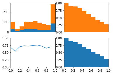
probability_histogram_class(probability,y)
Importantly, this demonstrates that even with imbalanced classes, if a model is at chance, then the ROC curve will reflect this chance perforomance. I do a similar demonstration with fake data here.
In SQL it’s easy to find people in one list who are not in a second list (i.e., the “not in” command), but there is no similar command in PySpark. Well, at least not a command that doesn’t involve collecting the second list onto the master instance.
EDIT
Check the note at the bottom regarding “anti joins”. Using an anti join is much cleaner than the code described here.
Here is a tidbit of code which replicates SQL’s “not in” command, while keeping your data with the workers (it will require a shuffle).
EDIT
I recently gave the PySpark documentation a more thorough reading and realized that PySpark’s join command has a left_anti option. The left_anti option produces the same functionality as described above, but in a single join command (no need to create a dummy column and filter).
For example, the following code will produce rows in b where the id value is not present in a.