Now that the NBA season is done, we have complete data from this year’s NBA rookies. In the past I have tried to predict NBA rookies’ future performance using regressionmodels. In this post I am again trying to predict rookies’ future performance, but now using using a classification approach. When using a classification approach, I predict whether player X will be a “great,” “average,” or “poor” player rather than predicting exactly how productive player X will be.
Much of this post re-uses code from the previous posts, so I skim over some of the repeated code.
As usual, I will post all code as a jupyter notebook on my github.
1234567
#import some libraries and tell ipython we want inline figures rather than interactive figures. importmatplotlib.pyplotasplt,pandasaspd,numpyasnp,matplotlibasmplfrom__future__importprint_function%matplotlibinlineplt.style.use('ggplot')#im addicted to ggplot. so pretty.
Load the data. Reminder - this data is available on my github.
12345678
rookie_df=pd.read_pickle('nba_bballref_rookie_stats_2016_Apr_16.pkl')#here's the rookie year datarook_games=rookie_df['Career Games']>50#only attempting to predict players that have played at least 50 gamesrook_year=rookie_df['Year']>1980#only attempting to predict players from after 1980#remove rookies from before 1980 and who have played less than 50 games. I also remove some features that seem irrelevant or unfairrookie_df_games=rookie_df[rook_games&rook_year]#only players with more than 50 games. rookie_df_drop=rookie_df_games.drop(['Year','Career Games','Name'],1)
fromsklearn.preprocessingimportStandardScalerdf=pd.read_pickle('nba_bballref_career_stats_2016_Apr_15.pkl')df=df[df['G']>50]df_drop=df.drop(['Year','Name','G','GS','MP','FG','FGA','FG%','3P','2P','FT','TRB','PTS','ORtg','DRtg','PER','TS%','3PAr','FTr','ORB%','DRB%','TRB%','AST%','STL%','BLK%','TOV%','USG%','OWS','DWS','WS','WS/48','OBPM','DBPM','BPM','VORP'],1)X=df_drop.as_matrix()#take data out of dataframeScaleModel=StandardScaler().fit(X)#make sure each feature has 0 mean and unit variance. X=ScaleModel.transform(X)
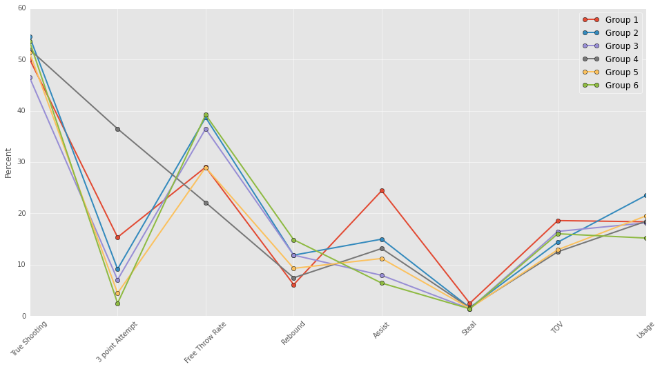
In the past I used k-means to group players according to their performance (see my post on grouping players for more info). Here, I use a gaussian mixture model (GMM) to group the players. I use the GMM model because it assigns each player a “soft” label rather than a “hard” label. By soft label I mean that a player simultaneously belongs to several groups. For instance, Russell Westbrook belongs to both my “point guard” group and my “scorers” group. K-means uses hard labels where each player can only belong to one group. I think the GMM model provides a more accurate representation of players, so I’ve decided to use it in this post. Maybe in a future post I will spend more time describing it.
For anyone wondering, the GMM groupings looked pretty similar to the k-means groupings.
12345678910111213
fromsklearn.mixtureimportGMMfromsklearn.decompositionimportPCAreduced_model=PCA(n_components=5,whiten=True).fit(X)reduced_data=reduced_model.transform(X)#transform data into the 5 PCA components spaceg=GMM(n_components=6).fit(reduced_data)#6 clusters. like the k-means modelnew_labels=g.predict(reduced_data)predictions=g.predict_proba(reduced_data)#generate values describing "how much" each player belongs to each group forxinnp.unique(new_labels):Label='Category%d'%xdf[Label]=predictions[:,x]
In this past I have attempted to predict win shares per 48 minutes. I am using win shares as a dependent variable again, but I want to categorize players.
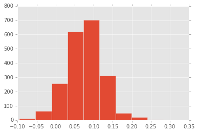
Below I create a histogram of players’ win shares per 48.
I split players into 4 groups which I will refer to as “bad,” “below average,” “above average,” and “great”: Poor players are the bottom 10% in win shares per 48, Below average are the 10-50th percentiles, Above average and 50-90th percentiles, Great are the top 10%. This assignment scheme is relatively arbitrary; the model performs similarly with different assignment schemes.
12345678
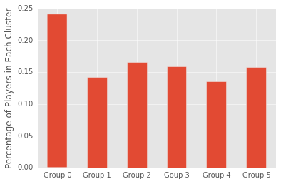
plt.hist(df['WS/48']);df['perf_cat']=0df.loc[df['WS/48']<np.percentile(df['WS/48'],10),'perf_cat']=1#category 1 players are bottom 10%df.loc[(df['WS/48']<np.percentile(df['WS/48'],50))&(df['WS/48']>=np.percentile(df['WS/48'],10)),'perf_cat']=2df.loc[(df['WS/48']<np.percentile(df['WS/48'],90))&(df['WS/48']>=np.percentile(df['WS/48'],50)),'perf_cat']=3df.loc[df['WS/48']>=np.percentile(df['WS/48'],90),'perf_cat']=4#category 4 players are top 10%perc_in_cat=[np.mean(df['perf_cat']==x)forxinnp.unique(df['perf_cat'])];perc_in_cat#print % of palyers in each category as a sanity check
My goal is to use rookie year performance to classify players into these 4 categories. I have a big matrix with lots of data about rookie year performance, but the reason that I grouped player using the GMM is because I suspect that players in the different groups have different “paths” to success. I am including the groupings in my classification model and computing interaction terms. The interaction terms will allow rookie performance to produce different predictions for the different groups.
By including interaction terms, I include quite a few predictor features. I’ve printed the number of predictor features and the number of predicted players below.
12345678910111213141516
fromsklearnimportpreprocessingdf_drop=df[df['Year']>1980]forxinnp.unique(new_labels):Label='Category%d'%xrookie_df_drop[Label]=df_drop[Label]#give rookies the groupings produced by the GMM modelX=rookie_df_drop.as_matrix()#take data out of dataframe poly=preprocessing.PolynomialFeatures(2,interaction_only=True)#create interaction terms.X=poly.fit_transform(X)Career_data=df[df['Year']>1980]Y=Career_data['perf_cat']#get predictor dataprint(np.shape(X))print(np.shape(Y))
(1703, 1432)
(1703,)
Now that I have all the features, it’s time to try and predict which players will be poor, below average, above average, and great. To create these predictions, I will use a logistic regression model.
Because I have so many predictors, correlation between predicting features and over-fitting the data are major concerns. I use regularization and cross-validation to combat these issues.
Specifically, I am using l2 regularization and k-fold 5 cross-validation. Within the cross-validation, I am trying to estimate how much regularization is appropriate.
Some important notes - I am using “balanced” weights which tells the model that worse to incorrectly predict the poor and great players than the below average and above average players. I do this because I don’t want the model to completely ignore the less frequent classifications. Second, I use the multi_class multinomial because it limits the number of models I have to fit.
123456789
fromsklearnimportlinear_modelfromsklearn.metricsimportaccuracy_scorelogreg=linear_model.LogisticRegressionCV(Cs=[0.0008],cv=5,penalty='l2',n_jobs=-1,class_weight='balanced',max_iter=15000,multi_class='multinomial')est=logreg.fit(X,Y)score=accuracy_score(Y,est.predict(X))#calculate the % correct print(score)
0.738109219025
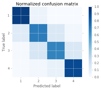
Okay, the model did pretty well, but lets look at where the errors are coming from. To visualize the models accuracy, I am using a confusion matrix. In a confusion matrix, every item on the diagnonal is a correctly classified item. Every item off the diagonal is incorrectly classified. The color bar’s axis is the percent correct. So the dark blue squares represent cells with more items.
It seems the model is best at predicting poor players and great players. It makes more errors when trying to predict the more average players.
Lets look at what the model predicts for this year’s rookies. Below I modified two functions that I wrote for a previous post. The first function finds a particular year’s draft picks. The second function produces predictions for each draft pick.
defgather_draftData(Year):importurllib2frombs4importBeautifulSoupimportpandasaspdimportnumpyasnpdraft_len=30defconvert_float(val):try:returnfloat(val)exceptValueError:returnnp.nanurl='http://www.basketball-reference.com/draft/NBA_'+str(Year)+'.html'html=urllib2.urlopen(url)soup=BeautifulSoup(html,"lxml")draft_num=[soup.findAll('tbody')[0].findAll('tr')[i].findAll('td')[0].textforiinrange(draft_len)]draft_nam=[soup.findAll('tbody')[0].findAll('tr')[i].findAll('td')[3].textforiinrange(draft_len)]draft_df=pd.DataFrame([draft_num,draft_nam]).Tdraft_df.columns=['Number','Name']df.index=range(np.size(df,0))returndraft_dfdefplayer_prediction__regressionModel(PlayerName):clust_df=pd.read_pickle('nba_bballref_career_stats_2016_Apr_15.pkl')clust_df=clust_df[clust_df['Name']==PlayerName]clust_df=clust_df.drop(['Year','Name','G','GS','MP','FG','FGA','FG%','3P','2P','FT','TRB','PTS','ORtg','DRtg','PER','TS%','3PAr','FTr','ORB%','DRB%','TRB%','AST%','STL%','BLK%','TOV%','USG%','OWS','DWS','WS','WS/48','OBPM','DBPM','BPM','VORP'],1)new_vect=ScaleModel.transform(clust_df.as_matrix().reshape(1,-1))reduced_data=reduced_model.transform(new_vect)predictions=g.predict_proba(reduced_data)forxinnp.unique(new_labels):Label='Category%d'%xclust_df[Label]=predictions[:,x]Predrookie_df=pd.read_pickle('nba_bballref_rookie_stats_2016_Apr_16.pkl')Predrookie_df=Predrookie_df[Predrookie_df['Name']==PlayerName]Predrookie_df=Predrookie_df.drop(['Year','Career Games','Name'],1)forxinnp.unique(new_labels):Label='Category%d'%xPredrookie_df[Label]=clust_df[Label]#give rookies the groupings produced by the GMM modelpredX=Predrookie_df.as_matrix()#take data out of dataframepredX=poly.fit_transform(predX)predictions2=est.predict_proba(predX)return{'Name':PlayerName,'Group':predictions,'Prediction':predictions2[0]}
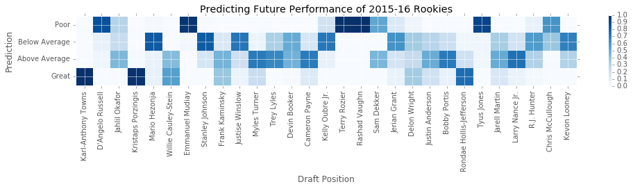
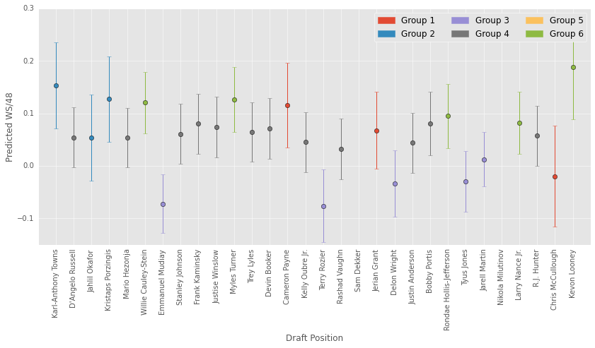
Below I create a plot depicting the model’s predictions. On the y-axis are the four classifications. On the x-axis are the players from the 2015 draft. Each cell in the plot is the probability of a player belonging to one of the classifications. Again, dark blue means a cell or more likely. Good news for us T-Wolves fans! The model loves KAT.
1234567891011121314151617181920212223
draft_df=gather_draftData(2015)draft_df['Name'][14]='Kelly Oubre Jr.'#annoying name inconsistencies plt.subplots(figsize=(14,6));draft_df=draft_df.drop(25,0)#spurs' 1st round pick has not played yetpredictions=[]fornameindraft_df['Name']:draft_num=draft_df[draft_df['Name']==name]['Number']predict_dict=player_prediction__regressionModel(name)predictions.append(predict_dict['Prediction'])plt.imshow(np.array(predictions).T,interpolation='nearest',cmap=plt.cm.Blues,vmin=0.0,vmax=1.0)plt.title('Predicting Future Performance of 2015-16 Rookies')plt.colorbar(shrink=0.25)tick_marks=np.arange(len(np.unique(df['perf_cat'])))plt.xticks(range(0,29),draft_df['Name'],rotation=90)plt.yticks(range(0,4),['Poor','Below Average','Above Average','Great'])plt.tight_layout()plt.ylabel('Prediction')plt.xlabel('Draft Position');
All basketball teams have a camera system called SportVU installed in their arenas. These camera systems track players and the ball throughout a basketball game.
The data produced by sportsvu camera systems used to be freely available on NBA.com, but was recently removed (I have no idea why). Luckily, the data for about 600 games are available on neilmj’s github. In this post, I show how to create a video recreation of a given basketball play using the sportsvu data.
This code is also available as a jupyter notebook on my github.
12345
#import some librariesimportmatplotlib.pyplotasplt,pandasaspd,numpyasnp,matplotlibasmplfrom__future__importprint_functionmpl.rcParams['font.family']=['Bitstream Vera Sans']
The data is provided as a json. Here’s how to import the python json library and load the data. I’m a T-Wolves fan, so the game I chose is a wolves game.
123
importjson#import json libraryjson_data=open('/home/dan-laptop/github/BasketballData/2016.NBA.Raw.SportVU.Game.Logs/0021500594.json')#import the data from wherever you saved it.data=json.load(json_data)#load the data
Let’s take a quick look at the data. It’s a dictionary with three keys: gamedate, gameid, and events. Gamedate and gameid are the date of this game and its specific id number, respectively. Events is the structure with data we’re interested in.
1
data.keys()
[u'gamedate', u'gameid', u'events']
Lets take a look at the first event. The first event has an associated eventid number. We will use these later. There’s also data for each player on the visiting and home team. We will use these later too. Finally, and most importantly, there’s the “moments.” There are 25 moments for each second of the “event” (the data is sampled at 25hz).
1
data['events'][0].keys()
[u'eventId', u'visitor', u'moments', u'home']
Here’s the first moment of the first event. The first number is the quarter. The second number is the time of the event in milliseconds. The third number is the number of seconds left in the quarter (the 1st quarter hasn’t started yet, so 12 * 60 = 720). The fourth number is the number of seconds left on the shot clock. I am not sure what fourth number (None) represents.
The final matrix is 11x5 matrix. The first row describes the ball. The first two columns are the teamID and the playerID of the ball (-1 for both because the ball does not belong to a team and is not a player). The 3rd and 4th columns are xy coordinates of the ball. The final column is the height of the ball (z coordinate).
The next 10 rows describe the 10 players on the court. The first 5 players belong to the home team and the last 5 players belong to the visiting team. Each player has his teamID, playerID, xy&z coordinates (although I don’t think players’ z coordinates ever change).
Alright, so we have the sportsvu data, but its not clear what each event is. Luckily, the NBA also provides play by play (pbp) data. I write a function for acquiring play by play game data. This function collects (and trims) the play by play data for a given sportsvu data set.
123456789101112131415161718192021222324
defacquire_gameData(data):importrequestsheader_data={#I pulled this header from the py goldsberry library'Accept-Encoding':'gzip, deflate, sdch','Accept-Language':'en-US,en;q=0.8','Upgrade-Insecure-Requests':'1','User-Agent':'Mozilla/5.0 (Windows NT 10.0; WOW64)'\
' AppleWebKit/537.36 (KHTML, like Gecko) Chrome/48.0.2564.82 '\
'Safari/537.36','Accept':'text/html,application/xhtml+xml,application/xml;q=0.9'\
',image/webp,*/*;q=0.8','Cache-Control':'max-age=0','Connection':'keep-alive'}game_url='http://stats.nba.com/stats/playbyplayv2?EndPeriod=0&EndRange=0&GameID='+data['gameid']+\
'&RangeType=0&StartPeriod=0&StartRange=0'#address for querying the dataresponse=requests.get(game_url,headers=header_data)#go get the dataheaders=response.json()['resultSets'][0]['headers']#get headers of datagameData=response.json()['resultSets'][0]['rowSet']#get actual data from json objectdf=pd.DataFrame(gameData,columns=headers)#turn the data into a pandas dataframedf=df[[df.columns[1],df.columns[2],df.columns[7],df.columns[9],df.columns[18]]]#there's a ton of data here, so I trim it doowndf['TEAM']=df['PLAYER1_TEAM_ABBREVIATION']df=df.drop('PLAYER1_TEAM_ABBREVIATION',1)returndf
Below I show what the play by play data looks like. There’s a column for event number (eventnum). These event numbers match up with the event numbers from the sportsvu data, so we will use this later for seeking out specific plays in the sportsvu data. There’s a column for the event type (eventmsgtype). This column has a number describing what occured in the play. I list these number codes in the comments below.
There’s also short text descriptions of the plays in the home description and visitor description columns. Finally, I use the team column to represent the primary team involved in a play.
I stole the idea of using play by play data from Raji Shah.
123456789101112131415
df=acquire_gameData(data)df.head()#EVENTMSGTYPE#1 - Make #2 - Miss #3 - Free Throw #4 - Rebound #5 - out of bounds / Turnover / Steal #6 - Personal Foul #7 - Violation #8 - Substitution #9 - Timeout #10 - Jumpball #12 - Start Q1? #13 - Start Q2?
EVENTNUM
EVENTMSGTYPE
HOMEDESCRIPTION
VISITORDESCRIPTION
TEAM
0
0
12
None
None
None
1
1
10
Jump Ball Adams vs. Towns: Tip to Ibaka
None
OKC
2
2
5
Westbrook Out of Bounds Lost Ball Turnover (P1...
None
OKC
3
3
2
None
MISS Wiggins 16' Jump Shot
MIN
4
4
4
Westbrook REBOUND (Off:0 Def:1)
None
OKC
When viewing the videos, its nice to know what players are on the court. I like to depict this by labeling each player with their number. Here I create a dictionary that contains each player’s id number (these are assigned by nba.com) as the key and their jersey number as the associated value.
Alright, almost there! Below I write some functions for creating the actual video! First, there’s a short function for placing an image of the basketball court beneath our depiction of players moving around. This image is from gmf05’s github, but I will provide it on mine too.
Much of this code is either straight from gmf05’s github or slightly modified.
1234567891011121314151617181920212223242526
# Animation function / loopdefdraw_court(axis):importmatplotlib.imageasmpimgimg=mpimg.imread('./nba_court_T.png')#read image. I got this image from gmf05's github.plt.imshow(img,extent=axis,zorder=0)#show the image. defanimate(n):#matplotlib's animation function loops through a function n times that draws a different frame on each iterationfori,iiinenumerate(player_xy[n]):#loop through all the playersplayer_circ[i].center=(ii[1],ii[2])#change each players xy positionplayer_text[i].set_text(str(jerseydict[ii[0]]))#draw the text for each player. player_text[i].set_x(ii[1])#set the text x positionplayer_text[i].set_y(ii[2])#set text y positionball_circ.center=(ball_xy[n,0],ball_xy[n,1])#change ball xy positionball_circ.radius=1.1#i could change the size of the ball according to its height, but chose to keep this constantreturntuple(player_text)+tuple(player_circ)+(ball_circ,)definit():#this is what matplotlib's animation will create before drawing the first frame. foriinrange(10):#set up playersplayer_text[i].set_text('')ax.add_patch(player_circ[i])ax.add_patch(ball_circ)#create ballax.axis('off')#turn off axisdx=5plt.xlim([0-dx,100+dx])#set axisplt.ylim([0-dx,50+dx])returntuple(player_text)+tuple(player_circ)+(ball_circ,)
The event that I want to depict is event 41. In this event, Karl Anthony Towns misses a shot, grabs his own rebounds, and puts it back in.
1
df[37:38]
EVENTNUM
EVENTMSGTYPE
HOMEDESCRIPTION
VISITORDESCRIPTION
TEAM
37
41
1
None
Towns 1' Layup (2 PTS)
MIN
We need to find where event 41 is in the sportsvu data structure, so I created a function for finding the location of a particular event. I then create a matrix with position data for the ball and a matrix with position data for each player for event 41.
123456789101112
#the order of events does not match up, so we have to use the eventIds. This loop finds the correct event for a given id#.search_id=41deffind_moment(search_id):fori,eventsinenumerate(data['events']):ifevents['eventId']==str(search_id):finder=ibreakreturnfinderevent_num=find_moment(search_id)ball_xy=np.array([x[5][0][2:5]forxindata['events'][event_num]['moments']])#create matrix of ball dataplayer_xy=np.array([np.array(x[5][1:])[:,1:4]forxindata['events'][event_num]['moments']])#create matrix of player data
Okay. We’re actually there! Now we get to create the video. We have to create figure and axes objects for the animation to draw on. Then I place a picture of the basketball court on this plot. Finally, I create the circle and text objects that will move around throughout the video (depicting the ball and players). The location of these objects are then updated in the animation loop.
123456789101112131415161718
importmatplotlib.animationasanimationfig=plt.figure(figsize=(15,7.5))#create figure objectax=plt.gca()#create axis objectdraw_court([0,100,0,50])#draw the courtplayer_text=range(10)#create player text vectorplayer_circ=range(10)#create player circle vectorball_circ=plt.Circle((0,0),1.1,color=[1,0.4,0])#create circle object for balforiinrange(10):#create circle object and text object for each playercol=['w','k']ifi<5else['k','w']#color schemeplayer_circ[i]=plt.Circle((0,0),2.2,facecolor=col[0],edgecolor='k')#player circleplayer_text[i]=ax.text(0,0,'',color=col[1],ha='center',va='center')#player jersey # (text)ani=animation.FuncAnimation(fig,animate,frames=np.arange(0,np.size(ball_xy,0)),init_func=init,blit=True,interval=5,repeat=False,\
save_count=0)#function for making videoani.save('Event_%d.mp4'%(search_id),dpi=100,fps=25)#function for saving videoplt.close('all')#close the plot
I’ve been told this video does not work for all users. I’ve also posted it on youtube.
For some reason I recently got it in my head that I wanted to go back and create more NBA shot charts. My previous shotcharts used colored circles to depict the frequency and effectiveness of shots at different locations. This is an extremely efficient method of representing shooting profiles, but I thought it would be fun to create shot charts that represent a player’s shooting profile continously across the court rather than in discrete hexagons.
By depicting the shooting data continously, I lose the ability to represent one dimenion - I can no longer use the size of circles to depict shot frequency at a location. Nonetheless, I thought it would be fun to create these charts.
I explain how to create them below. I’ve also included the ability to compare a player’s shooting performance to the league average.
In my previous shot charts, I query nba.com’s API when creating a players shot chart, but querying nba.com’s API for every shot taken in 2015-16 takes a little while (for computing league average), so I’ve uploaded this data to my github and call the league data as a file rather than querying nba.com API.
This code is also available as a jupyter notebook on my github.
123
#import some libraries and tell ipython we want inline figures rather than interactive figures.%matplotlibinlineimportmatplotlib.pyplotasplt,pandasaspd,numpyasnp,matplotlibasmpl
Here, I create a function for querying shooting data from NBA.com’s API. This is the same function I used in my previous post regarding shot charts.
You can find a player’s ID number by going to the players nba.com page and looking at the page address. There is a python library that you can use for querying player IDs (and other data from the nba.com API), but I’ve found this library to be a little shaky.
12345678910111213141516171819202122232425
defaqcuire_shootingData(PlayerID,Season):importrequestsheader_data={#I pulled this header from the py goldsberry library'Accept-Encoding':'gzip, deflate, sdch','Accept-Language':'en-US,en;q=0.8','Upgrade-Insecure-Requests':'1','User-Agent':'Mozilla/5.0 (Windows NT 10.0; WOW64)'\
' AppleWebKit/537.36 (KHTML, like Gecko) Chrome/48.0.2564.82 '\
'Safari/537.36','Accept':'text/html,application/xhtml+xml,application/xml;q=0.9'\
',image/webp,*/*;q=0.8','Cache-Control':'max-age=0','Connection':'keep-alive'}shot_chart_url='http://stats.nba.com/stats/shotchartdetail?CFID=33&CFPARAMS='+Season+'&ContextFilter='\
'&ContextMeasure=FGA&DateFrom=&DateTo=&GameID=&GameSegment=&LastNGames=0&LeagueID='\
'00&Location=&MeasureType=Base&Month=0&OpponentTeamID=0&Outcome=&PaceAdjust='\
'N&PerMode=PerGame&Period=0&PlayerID='+PlayerID+'&PlusMinus=N&Position=&Rank='\
'N&RookieYear=&Season='+Season+'&SeasonSegment=&SeasonType=Regular+Season&TeamID='\
'0&VsConference=&VsDivision=&mode=Advanced&showDetails=0&showShots=1&showZones=0'response=requests.get(shot_chart_url,headers=header_data)headers=response.json()['resultSets'][0]['headers']shots=response.json()['resultSets'][0]['rowSet']shot_df=pd.DataFrame(shots,columns=headers)returnshot_df
Write a function for acquiring each player’s picture. This isn’t essential, but it makes things look nicer. This function takes a playerID number and the amount to zoom in on an image as the inputs. It by default places the image at the location 500,500.
Here is where things get a little complicated. Below I write a function that divides the shooting data into a 25x25 matrix. Each shot taken within the xy coordinates encompassed by a given bin counts towards the shot count in that bin. In this way, the method I am using here is very similar to my previous hexbins (circles). So the difference just comes down to I present the data rather than how I preprocess it.
This function takes a dataframe with a vector of shot locations in the X plane, a vector with shot locations in the Y plane, a vector with shot type (2 pointer or 3 pointer), and a vector with ones for made shots and zeros for missed shots. The function by default bins the data into a 25x25 matrix, but the number of bins is editable. The 25x25 bins are then expanded to encompass a 500x500 space.
The output is a dictionary containing matrices for shots made, attempted, and points scored in each bin location. The dictionary also has the player’s ID number.
1234567891011121314151617181920212223242526272829
defshooting_matrices(df,bins=25):frommathimportfloordf['SHOT_TYPE2']=[int(x[0][0])forxindf['SHOT_TYPE']]#create a vector with whether the shot is a 2 or 3 pointerpoints_matrix=np.zeros((bins,bins))#create a matrix to fill with shooting data.shot_attempts,xtest,ytest,p=plt.hist2d(df[df['LOC_Y']<425.1]['LOC_X'],#use histtd to bin the data. These are attemptsdf[df['LOC_Y']<425.1]['LOC_Y'],bins=bins,range=[[-250,250],[-25,400]]);#i limit the range of the bins because I don't care about super far away shots and I want the bins standardized across playersplt.close()shot_made,xtest2,ytest2,p=plt.hist2d(df[(df['LOC_Y']<425.1)&(df['SHOT_MADE_FLAG']==1)]['LOC_X'],#again use hist 2d to bin made shotsdf[(df['LOC_Y']<425.1)&(df['SHOT_MADE_FLAG']==1)]['LOC_Y'],bins=bins,range=[[-250,250],[-25,400]]);plt.close()differy=np.diff(ytest)[0]#get the leading yedgedifferx=np.diff(xtest)[0]#get the leading xedgefori,(x,y)inenumerate(zip(df['LOC_X'],df['LOC_Y'])):ifx>=250orx<=-250ory<=-25.1ory>=400:continuepoints_matrix[int(floor(np.divide(x+250,differx))),int(floor(np.divide(y+25,differy)))]+=np.float(df['SHOT_MADE_FLAG'][i]*df['SHOT_TYPE2'][i])#loop through all the shots and tally the points made in each bin location.shot_attempts=np.repeat(shot_attempts,500/bins,axis=0)#repeat the shot attempts matrix so that it fills all xy pointsshot_attempts=np.repeat(shot_attempts,500/bins,axis=1)shot_made=np.repeat(shot_made,500/bins,axis=0)#repeat shot made so that it fills all xy points (rather than just bin locations)shot_made=np.repeat(shot_made,500/bins,axis=1)points_matrix=np.repeat(points_matrix,500/bins,axis=0)#again repeat with pointspoints_matrix=np.repeat(points_matrix,500/bins,axis=1)return{'attempted':shot_attempts,'made':shot_made,'points':points_matrix,'id':str(np.unique(df['PLAYER_ID'])[0])}
Below I load the league average data. I also have the code that I used to originally download the data and to preprocess it.
123456789
importpickle#df = aqcuire_shootingData('0','2015-16') #here is how I acquired data about every shot taken in 2015-16#df2 = pd.read_pickle('nba_shots_201516_2016_Apr_27.pkl') #here is how you can read all the league shot data#league_shotDict = shooting_matrices(df2) #turn the shot data into the shooting matrix#pickle.dump(league_shotDict, open('league_shotDictionary_2016.pkl', 'wb' )) #save the data#I should make it so this is the plot size by default, but people can change it if they want. this would be slower.league_shotDict=pickle.load(open('league_shotDictionary_2016.pkl','rb'))#read in the a precreated shot chart for the entire league
I really like playing with the different color maps, so here is a new color map I created for these shot charts.
123456789101112131415
cmap=plt.cm.CMRmap_r#start with the CMR map in reverse.maxer=0.6#max value to take in the CMR mapthe_range=np.arange(0,maxer+0.1,maxer/4)#divide the map into 4 valuesthe_range2=[0.0,0.25,0.5,0.75,1.0]#or use these valuesmapper=[cmap(x)forxinthe_range]#grab color values for this dictionarycdict={'red':[],'green':[],'blue':[]}#fill teh values into a color dictionaryforitem,placeinzip(mapper,the_range2):cdict['red'].append((place,item[0],item[0]))cdict['green'].append((place,item[1],item[1]))cdict['blue'].append((place,item[2],item[2]))mymap=mpl.colors.LinearSegmentedColormap('my_colormap',cdict,1024)#linearly interpolate between color values
Below, I write a function for creating the nba shot charts. The function takes a dictionary with martrices for shots attempted, made, and points scored. The matrices should be 500x500. By default, the shot chart depicts the number of shots taken across locations, but it can also depict the number of shots made, field goal percentage, and point scored across locations.
The function uses a gaussian kernel with standard deviation of 5 to smooth the data (make it look pretty). Again, this is editable. By default the function plots a players raw data, but it will plot how a player compares to league average if the input includes a matrix of league average data.
defcreate_shotChart(shotDict,fig_type='attempted',smooth=5,league_shotDict=[],mymap=mymap):fromscipy.ndimage.filtersimportgaussian_filteriffig_type=='fg':#how to treat the data if depicting fg percentageinterest_measure=shotDict['made']/shotDict['attempted']#interest_measure[np.isnan(interest_measure)] = np.nanmean(interest_measure)#interest_measure = np.nan_to_num(interest_measure) #replace places where divide by 0 with a 0else:interest_measure=shotDict[fig_type]#else take the data from dictionary.ifleague_shotDict:#if we have league data, we have to select the relevant league data.iffig_type=='fg':league=league_shotDict['made']/league_shotDict['attempted']league=np.nan_to_num(league)interest_measure[np.isfinite(interest_measure)]+=-league[np.isfinite(interest_measure)]#compare league data and invidual player's datainterest_measure=np.nan_to_num(interest_measure)#replace places where divide by 0 with a 0maxer=0+1.5*np.std(interest_measure)#min and max values for color mapminner=0-1.5*np.std(interest_measure)else:player_percent=interest_measure/np.sum([x[::20]forxinplayer_shotDict[fig_type][::20]])#standardize data before comparingleague_percent=league_shotDict[fig_type]/np.sum([x[::20]forxinleague_shotDict[fig_type][::20]])#standardize league datainterest_measure=player_percent-league_percent#compare league and individual datamaxer=np.mean(interest_measure)+1.5*np.std(interest_measure)#compute max and min values for color mapminner=np.mean(interest_measure)-1.5*np.std(interest_measure)cmap='bwr'#use bwr color map if comparing to league averagelabel=['<Avg','Avg','>Avg']#color map legend labelelse:cmap=mymap#else use my color mapinterest_measure=np.nan_to_num(interest_measure)#replace places where divide by 0 with a 0maxer=np.mean(interest_measure)+1.5*np.std(interest_measure)#compute max for colormapminner=0label=['Less','','More']#color map legend labelppr_smooth=gaussian_filter(interest_measure,smooth)#smooth the datafig=plt.figure(figsize=(12,7),frameon=False)#(12,7)ax=fig.add_axes([0.1,0.1,0.8,0.8])#where to place the plot within the figuredraw_court(outer_lines=False)#draw courtax.set_xlim(-250,250)ax.set_ylim(400,-25)ax2=fig.add_axes(ax.get_position(),frameon=False)colrange=mpl.colors.Normalize(vmin=minner,vmax=maxer,clip=False)#standardize color rangeax2.imshow(ppr_smooth.T,cmap=cmap,norm=colrange,alpha=0.7,aspect='auto')#plot dataax2.set_xticklabels([])ax2.set_yticklabels([])ax2.set_xticks([])ax2.set_xlim(0,500)ax2.set_ylim(500,0)ax2.set_yticks([]);ax3=fig.add_axes([0.92,0.1,0.02,0.8])#place colormap legendcb=mpl.colorbar.ColorbarBase(ax3,cmap=cmap,orientation='vertical')iffig_type=='fg':#colormap labelcb.set_label('Field Goal Percentage')else:cb.set_label('Shots '+fig_type)cb.set_ticks([0,0.5,1.0])ax3.set_yticklabels(label,rotation=45);zoom=np.float(12)/(12.0*2)#place player picimg=acquire_playerPic(player_shotDict['id'],zoom)ax2.add_artist(img)plt.show()returnax
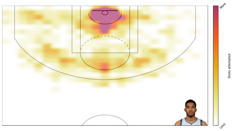
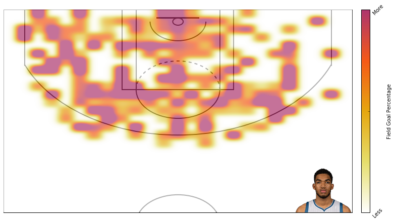
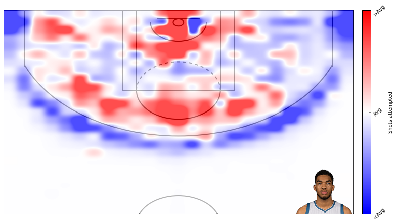
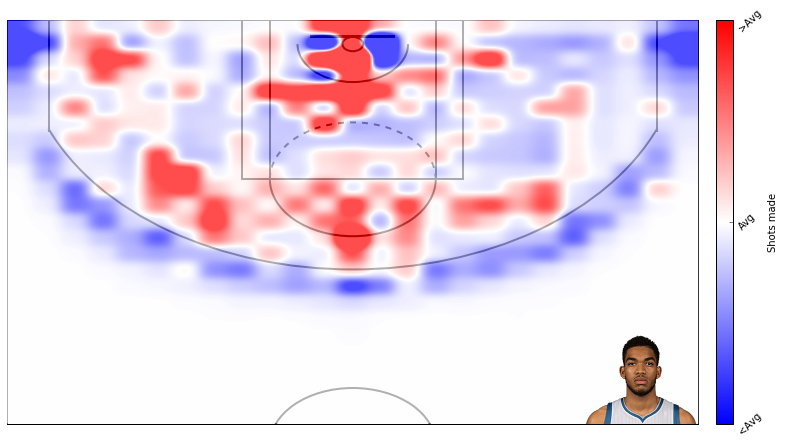
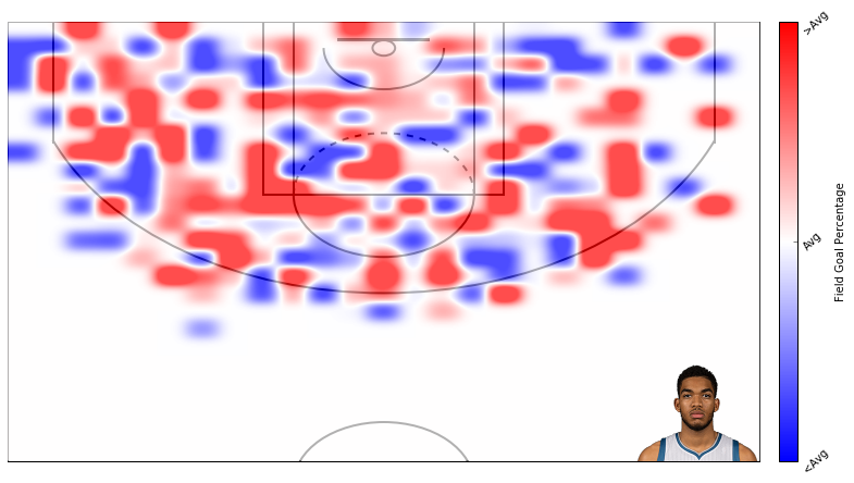
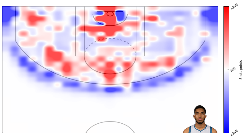
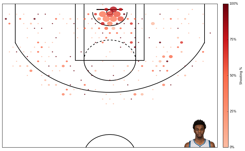
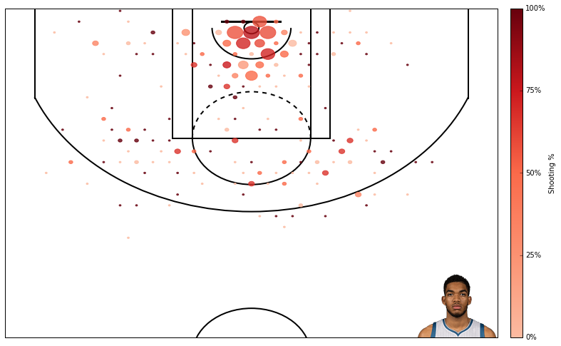
Alright, thats that. Now lets create some plots. I am a t-wolves fan, so I will plot data from Karl Anthony Towns.
Here’s field goal percentage. I don’t like this one too much. It’s hard to use similar scales for attempts and field goal percentage even though I’m using standard deviations rather than absolute scales.
In a previous post, I described how to do backpropogation with a 1-layer neural network. I’ve written this post assuming some familiarity with the previous post.
Researchers knew that adding an extra layer to the neural networks enabled neural networks to solve much more complex problems, but they didn’t know how to train these more complex networks.
In the previous post, I described “backpropogation,” but this wasn’t the portion of backpropogation that really changed the history of neural networks. What really changed neural networks is backpropogation with an extra layer. This extra layer enabled researchers to train more complex networks. The extra layer(s) is(are) called the hidden layer(s). In this post, I will describe backpropogation with a hidden layer.
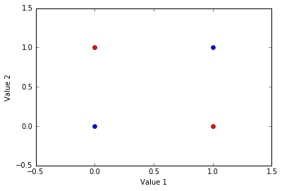
To describe backpropogation with a hidden layer, I will demonstrate how neural networks can solve the XOR problem.
In this example of the XOR problem there are four items. Each item is defined by two values. If these two values are the same, then the item belongs to one group (blue here). If the two values are different, then the item belongs to another group (red here).
Below, I have depicted the XOR problem. The goal is to find a model that can distinguish between the blue and red groups based on an item’s values.
This code is also available as a jupyter notebook on my github.
12345678910
importnumpyasnp#import important libraries.frommatplotlibimportpyplotaspltimportpandasaspd%matplotlibinlineplt.plot([0,1],[0,1],'bo')plt.plot([0,1],[1,0],'ro')plt.ylabel('Value 2')plt.xlabel('Value 1')plt.axis([-0.5,1.5,-0.5,1.5]);
Again, each item has two values. An item’s first value is represented on the x-axis. An items second value is represented on the y-axis. The red items belong to one category and the blue items belong to another.
This is a non-linear problem because no linear function can segregate the groups. For instance, a horizontal line could segregate the upper and lower items and a vertical line could segregate the left and right items, but no single linear function can segregate the red and blue items.
We need a non-linear function to seperate the groups, and neural networks can emulate a non-linear function that segregates them.
While this problem may seem relatively simple, it gave the initial neural networks quite a hard time. In fact, this is the problem that depleted much of the original enthusiasm for neural networks.
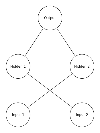
Neural networks can easily solve this problem, but they require an extra layer. Below I depict a network with an extra layer (a 2-layer network). To depict the network, I use a repository available on my github.
1234567
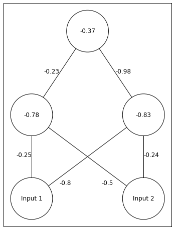
fromvisualise_neural_networkimportNeuralNetworknetwork=NeuralNetwork()#create neural network objectnetwork.add_layer(2,['Input 1','Input 2'])#input layer with namesnetwork.add_layer(2,['Hidden 1','Hidden 2'])#hidden layer with namesnetwork.add_layer(1,['Output'])#output layer with namenetwork.draw()
Notice that this network now has 5 total neurons. The two units at the bottom are the input layer. The activity of input units is the value of the inputs (same as the inputs in my previous post). The two units in the middle are the hidden layer. The activity of hidden units are calculated in the same manner as the output units from my previous post. The unit at the top is the output layer. The activity of this unit is found in the same manner as in my previous post, but the activity of the hidden units replaces the input units.
Thus, when the neural network makes its guess, the only difference is we have to compute an extra layer’s activity.
The goal of this network is for the output unit to have an activity of 0 when presented with an item from the blue group (inputs are same) and to have an activity of 1 when presented with an item from the red group (inputs are different).
One additional aspect of neural networks that I haven’t discussed is each non-input unit can have a bias. You can think about bias as a propensity for the unit to become active or not to become active. For instance, a unit with a postitive bias is more likely to be active than a unit with no bias.
I will implement bias as an extra line feeding into each unit. The weight of this line is the bias, and the bias line is always active, meaning this bias is always present.
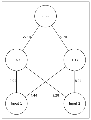
Below, I seed this 3-layer neural network with a random set of weights.
1234567891011121314151617181920
np.random.seed(seed=10)#seed random number generator for reproducibilityWeights_2=np.random.rand(1,3)-0.5*2#connections between hidden and outputWeights_1=np.random.rand(2,3)-0.5*2#connections between input and hiddenWeight_Dict={'Weights_1':Weights_1,'Weights_2':Weights_2}#place weights in a dictionaryTrain_Set=[[1.0,1.0],[0.0,0.0],[0.0,1.0],[1.0,0.0]]#train setnetwork=NeuralNetwork()network.add_layer(2,['Input 1','Input 2'],[[round(x,2)forxinWeight_Dict['Weights_1'][0][:2]],[round(x,2)forxinWeight_Dict['Weights_1'][1][:2]]])#add input layer with names and weights leaving the input neuronsnetwork.add_layer(2,[round(Weight_Dict['Weights_1'][0][2],2),round(Weight_Dict['Weights_1'][1][2],2)],[round(x,2)forxinWeight_Dict['Weights_2'][0][:2]])#add hidden layer with names (each units' bias) and weights leaving the hidden unitsnetwork.add_layer(1,[round(Weight_Dict['Weights_2'][0][2],2)])#add output layer with name (the output unit's bias)network.draw()
Above we have out network. The depiction of and are confusing. -0.8 belongs to . -0.5 belongs to .
Lets go through one example of our network receiving an input and making a guess. Lets say the input is [0 1].
This means and . The correct answer in this case is 1.
First, we have to calculate ’s input. Remember we can write input as
with the a bias we can rewrite it as
Specifically for
Remember the first term in the equation above is the bias term. Lets see what this looks like in code.
123
Input=np.array([0,1])net_Hidden=np.dot(np.append(Input,1.0),Weights_1.T)#append the bias inputprintnet_Hidden
[-1.27669634 -1.07035845]
Note that by using np.dot, I can calculate both hidden unit’s input in a single line of code.
Next, we have to find the activity of units in the hidden layer.
I will translate input into activity with a logistic function, as I did in the previous post.
Lets see what this looks like in code.
12345
deflogistic(x):#each neuron has a logistic activation functionreturn1.0/(1+np.exp(-x))Hidden_Units=logistic(net_Hidden)printHidden_Units
[ 0.2181131 0.25533492]
So far so good, the logistic function has transformed the negative inputs into values near 0.
Now we have to compute the output unit’s acitivity.
plugging in the numbers
Now the code for computing and the Output unit’s activity.
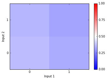
Okay, thats the network’s guess for one input…. no where near the correct answer (1). Let’s look at what the network predicts for the other input patterns. Below I create a feedfoward, 1-layer neural network and plot the neural nets’ guesses to the four input patterns.
123456789101112131415161718192021222324252627
deflayer_InputOutput(Inputs,Weights):#find a layers input and activityInputs_with_bias=np.append(Inputs,1.0)#input 1 for each unit's biasreturnlogistic(np.dot(Inputs_with_bias,Weights.T))defneural_net(Input,Weights_1,Weights_2,Training=False):#this function creates and runs the neural net target=1#set target valueifnp.array(Input[0])==np.array([Input[1]]):target=0#change target value if needed#forward passHidden_Units=layer_InputOutput(Input,Weights_1)#find hidden unit activityOutput=layer_InputOutput(Hidden_Units,Weights_2)#find Output layer actiityreturn{'output':Output,'target':target,'input':Input}#record trial outputTrain_Set=[[1.0,1.0],[0.0,1.0],[1.0,0.0],[0.0,0.0]]#the four input patternstempdict={'output':[],'target':[],'input':[]}#data dictionarytemp=[neural_net(Input,Weights_1,Weights_2)forInputinTrain_Set]#get the data[tempdict[key].append([temp[x][key]forxinrange(len(temp))])forkeyintempdict]#combine all the output dictionariesplotter=np.ones((2,2))*np.reshape(np.array(tempdict['output']),(2,2))plt.pcolor(plotter,vmin=0,vmax=1,cmap=plt.cm.bwr)plt.colorbar(ticks=[0,0.25,0.5,0.75,1]);plt.xlabel('Input 1')plt.ylabel('Input 2')plt.xticks([0.5,1.5],['0','1'])plt.yticks([0.5,1.5],['0','1']);
In the plot above, I have Input 1 on the x-axis and Input 2 on the y-axis. So if the Input is [0,0], the network produces the activity depicted in the lower left square. If the Input is [1,0], the network produces the activity depicted in the lower right square. If the network produces an output of 0, then the square will be blue. If the network produces an output of 1, then the square will be red. As you can see, the network produces all output between 0.25 and 0.5… no where near the correct answers.
So how do we update the weights in order to reduce the error between our guess and the correct answer?
First, we will do backpropogation between the output and hidden layers. This is exactly the same as backpropogation in the previous post.
In the previous post I described how our goal was to decrease error by changing the weights between units. This is the equation we used to describe changes in error with changes in the weights. The equation below expresses changes in error with changes to weights between the and the Output unit.
Now multiply this weight adjustment by the learning rate.
Finally, we apply the weight adjustment to .
Now lets do the same thing, but for both the weights and in the code.
12345678
alpha=0.5#learning ratetarget=1#target outpuerror=target-Output#amount of errordelta_out=np.atleast_2d(error*(Output*(1-Output)))#first two terms of error by weight derivativeHidden_Units=np.append(Hidden_Units,1.0)#add an input of 1 for the biasprintWeights_2+alpha*np.outer(delta_out,Hidden_Units)#apply weight change
[[-0.21252673 -0.96033892 -0.29229558]]
The hidden layer changes things when we do backpropogation. Above, we computed the new weights using the output unit’s error. Now, we want to find how adjusting a weight changes the error, but this weight connects an input to the hidden layer rather than connecting to the output layer. This means we have to propogate the error backwards to the hidden layer.
We will describe backpropogation for the line connecting and as
Pretty similar. We just replaced Output with . The interpretation (starting with the final term and moving left) is that changing the changes ’s input. Changing ’s input changes ’s activity. Changing ’s activity changes the error. This last assertion (the first term) is where things get complicated. Lets take a closer look at this first term
Changing ’s activity changes changes the input to the Output unit. Changing the output unit’s input changes the error. hmmmm still not quite there yet. Lets look at how changes to the output unit’s input changes the error.
You can probably see where this is going. Changing the output unit’s input changes the output unit’s activity. Changing the output unit’s activity changes error. There we go.
Okay, this got a bit heavy, but here comes some good news. Compare the two terms of the equation above to the first two terms of our original backpropogation equation. They’re the same! Now lets look at (the second term from the first equation after our new backpropogation equation).
Again, I am glossing over how to derive these partial derivatives. For a more complete explantion, I recommend Chapter 8 of Rumelhart and McClelland’s PDP book. Nonetheless, this means we can take the output of our function delta_output multiplied by and we have the first term of our backpropogation equation! We want to be the weight used in the forward pass. Not the updated weight.
The second two terms from our backpropogation equation are the same as in our original backpropogation equation.
- this is specific to logistic activation functions.
and
Lets try and write this out.
It’s not short, but its doable. Let’s plug in the numbers.
Not too bad. Now lets see the code.
1234
delta_hidden=delta_out.dot(Weights_2)*(Hidden_Units*(1-Hidden_Units))#find delta portion of weight updatedelta_hidden=np.delete(delta_hidden,2)#remove the bias inputprintWeights_1+alpha*np.outer(delta_hidden,np.append(Input,1.0))#append bias input and multiply input by delta portion
Alright! Lets implement all of this into a single model and train the model on the XOR problem. Below I create a neural network that includes both a forward pass and an optional backpropogation pass.
1234567891011121314151617181920212223242526272829
defneural_net(Input,Weights_1,Weights_2,Training=False):#this function creates and runs the neural net target=1#set target valueifnp.array(Input[0])==np.array([Input[1]]):target=0#change target value if needed#forward passHidden_Units=layer_InputOutput(Input,Weights_1)#find hidden unit activityOutput=layer_InputOutput(Hidden_Units,Weights_2)#find Output layer actiityifTraining==True:alpha=0.5#learning rateWeights_2=np.atleast_2d(Weights_2)#make sure this weight vector is 2d.error=target-Output#errordelta_out=np.atleast_2d(error*(Output*(1-Output)))#delta between output and hiddenHidden_Units=np.append(Hidden_Units,1.0)#append an input for the biasdelta_hidden=delta_out.dot(np.atleast_2d(Weights_2))*(Hidden_Units*(1-Hidden_Units))#delta between hidden and inputWeights_2+=alpha*np.outer(delta_out,Hidden_Units)#update weightsdelta_hidden=np.delete(delta_hidden,2)#remove bias activityWeights_1+=alpha*np.outer(delta_hidden,np.append(Input,1.0))#update weightsifTraining==False:return{'output':Output,'target':target,'input':Input}#record trial outputelifTraining==True:return{'Weights_1':Weights_1,'Weights_2':Weights_2,'target':target,'output':Output,'error':error}
Okay, thats the network. Below, I train the network until its answers are very close to the correct answer.
12345678910111213141516
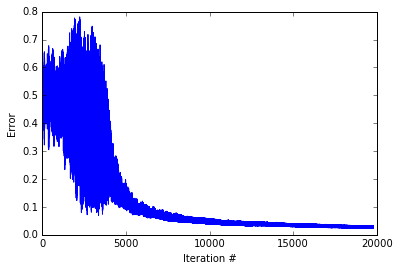
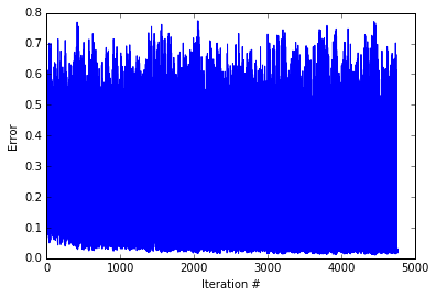
fromrandomimportchoicenp.random.seed(seed=10)#seed random number generator for reproducibilityWeights_2=np.random.rand(1,3)-0.5*2#connections between hidden and outputWeights_1=np.random.rand(2,3)-0.5*2#connections between input and hiddenWeight_Dict={'Weights_1':Weights_1,'Weights_2':Weights_2}Train_Set=[[1.0,1.0],[0.0,0.0],[0.0,1.0],[1.0,0.0]]#train setError=[]whileTrue:#train the neural netTrain_Dict=neural_net(choice(Train_Set),Weight_Dict['Weights_1'],Weight_Dict['Weights_2'],Training=True)Error.append(abs(Train_Dict['error']))iflen(Error)>6andnp.mean(Error[-10:])<0.025:break#tell the code to stop iterating when recent mean error is small
Really cool. The network start with volatile error - sometimes being nearly correct ans sometimes being completely incorrect. Then After about 5000 iterations, the network starts down the slow path of perfecting an answer scheme. Below, I create a plot depicting the networks’ activity for the different input patterns.
12345678910111213141516
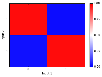
Weights_1=Weight_Dict['Weights_1']Weights_2=Weight_Dict['Weights_2']Train_Set=[[1.0,1.0],[0.0,1.0],[1.0,0.0],[0.0,0.0]]#train settempdict={'output':[],'target':[],'input':[]}#data dictionarytemp=[neural_net(Input,Weights_1,Weights_2)forInputinTrain_Set]#get the data[tempdict[key].append([temp[x][key]forxinrange(len(temp))])forkeyintempdict]#combine all the output dictionariesplotter=np.ones((2,2))*np.reshape(np.array(tempdict['output']),(2,2))plt.pcolor(plotter,vmin=0,vmax=1,cmap=plt.cm.bwr)plt.colorbar(ticks=[0,0.25,0.5,0.75,1]);plt.xlabel('Input 1')plt.ylabel('Input 2')plt.xticks([0.5,1.5],['0','1'])plt.yticks([0.5,1.5],['0','1']);
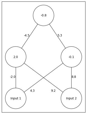
Again, the Input 1 value is on the x-axis and the Input 2 value is on the y-axis. As you can see, the network guesses 1 when the inputs are different and it guesses 0 when the inputs are the same. Perfect! Below I depict the network with these correct weights.
The network finds a pretty cool solution. Both hidden units are relatively active, but one hidden unit sends a strong postitive signal and the other sends a strong negative signal. The output unit has a negative bias, so if neither input is on, it will have an activity around 0. If both Input units are on, then the hidden unit that sends a postitive signal will be inhibited, and the output unit will have activity near 0. Otherwise, the hidden unit with a positive signal gives the output unit an acitivty near 1.
This is all well and good, but if you try to train this network with random weights you might find that it produces an incorrect set of weights sometimes. This is because the network runs into a local minima. A local minima is an instance when any change in the weights would increase the error, so the network is left with a sub-optimal set of weights.
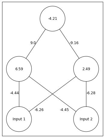
Below I hand-pick of set of weights that produce a local optima.
1234567891011121314
Weights_2=np.array([-4.5,5.3,-0.8])#connections between hidden and outputWeights_1=np.array([[-2.0,9.2,2.0],[4.3,8.8,-0.1]])#connections between input and hiddenWeight_Dict={'Weights_1':Weights_1,'Weights_2':Weights_2}network=NeuralNetwork()network.add_layer(2,['Input 1','Input 2'],[[round(x,2)forxinWeight_Dict['Weights_1'][0][:2]],[round(x,2)forxinWeight_Dict['Weights_1'][1][:2]]])network.add_layer(2,[round(Weight_Dict['Weights_1'][0][2],2),round(Weight_Dict['Weights_1'][1][2],2)],[round(x,2)forxinWeight_Dict['Weights_2'][:2]])network.add_layer(1,[round(Weight_Dict['Weights_2'][2],2)])network.draw()
Using these weights as the start of the training set, lets see what the network will do with training.
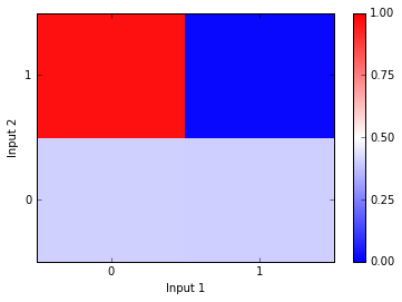
As you can see the network never reduces error. Let’s see how the network answers to the different input patterns.
12345678910111213141516
Weights_1=Weight_Dict['Weights_1']Weights_2=Weight_Dict['Weights_2']Train_Set=[[1.0,1.0],[0.0,1.0],[1.0,0.0],[0.0,0.0]]#train settempdict={'output':[],'target':[],'input':[]}#data dictionarytemp=[neural_net(Input,Weights_1,Weights_2)forInputinTrain_Set]#get the data[tempdict[key].append([temp[x][key]forxinrange(len(temp))])forkeyintempdict]#combine all the output dictionariesplotter=np.ones((2,2))*np.reshape(np.array(tempdict['output']),(2,2))plt.pcolor(plotter,vmin=0,vmax=1,cmap=plt.cm.bwr)plt.colorbar(ticks=[0,0.25,0.5,0.75,1]);plt.xlabel('Input 1')plt.ylabel('Input 2')plt.xticks([0.5,1.5],['0','1'])plt.yticks([0.5,1.5],['0','1']);
Looks like the network produces the correct answer in some cases but not others. The network is particularly confused when Inputs 2 is 0. Below I depict the weights after “training.” As you can see, they have not changed too much from where the weights started before training.
This network was unable to push itself out of the local optima. While local optima are a problem, they’re are a couple things we can do to avoid them. First, we should always train a network multiple times with different random weights in order to test for local optima. If the network continually finds local optima, then we can increase the learning rate. By increasing the learning rate, the network can escape local optima in some cases. This should be done with care though as too big of a learning rate can also prevent finding the global minima.
Alright, that’s it. Obviously the neural network behind alpha go is much more complex than this one, but I would guess that while alpha go is much larger the basic computations underlying it are similar.
Hopefully these posts have given you an idea for how neural networks function and why they’re so cool!
We use our most advanced technologies as metaphors for the brain: The industrial revolution inspired descriptions of the brain as mechanical. The telephone inspired descriptions of the brain as a telephone switchboard. The computer inspired descriptions of the brain as a computer. Recently, we have reached a point where our most advanced technologies - such as AI (e.g., Alpha Go), and our current understanding of the brain inform each other in an awesome synergy. Neural networks exemplify this synergy. Neural networks offer a relatively advanced description of the brain and are the software underlying some of our most advanced technology. As our understanding of the brain increases, neural networks become more sophisticated. As our understanding of neural networks increases, our understanding of the brain becomes more sophisticated.
With the recent success of neural networks, I thought it would be useful to write a few posts describing the basics of neural networks.
First, what are neural networks - neural networks are a family of machine learning algorithms that can learn data’s underlying structure. Neural networks are composed of many neurons that perform simple computations. By performing many simple computations, neural networks can answer even the most complicated problems.
Lets get started.
As usual, I will post this code as a jupyter notebook on my github.
1234
importnumpyasnp#import important libraries.frommatplotlibimportpyplotaspltimportpandasaspd%matplotlibinline
When talking about neural networks, it’s nice to visualize the network with a figure. For drawing the neural networks, I forked a repository from miloharper and made some changes so that this repository could be imported into python and so that I could label the network. Here is my forked repository.
1234567
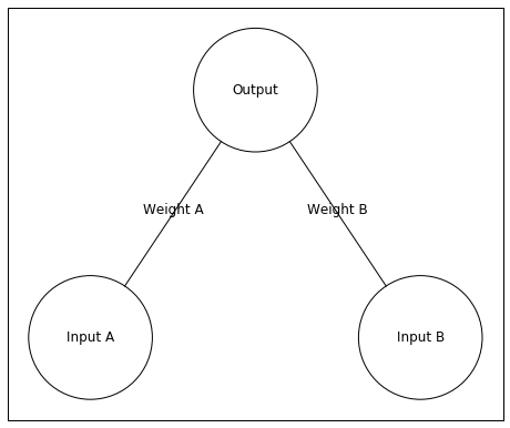
fromvisualise_neural_networkimportNeuralNetworknetwork=NeuralNetwork()#create neural network objectnetwork.add_layer(2,['Input A','Input B'],['Weight A','Weight B'])#create the input layer which has two neurons.#Each input neuron has a single line extending to the next layer upnetwork.add_layer(1,['Output'])#create output layer - a single output neuronnetwork.draw()#draw the network
Above is our neural network. It has two input neurons and a single output neuron. In this example, I’ll give the network an input of [0 1]. This means Input A will receive an input value of 0 and Input B will have an input value of 1.
The input is the input unit’s activity. This activity is sent to the Output unit, but the activity changes when traveling to the Output unit. The weights between the input and output units change the activity. A large positive weight between the input and output units causes the input unit to send a large positive (excitatory) signal. A large negative weight between the input and output units causes the input unit to send a large negative (inhibitory) signal. A weight near zero means the input unit does not influence the output unit.
In order to know the Output unit’s activity, we need to know its input. I will refer to the output unit’s input as . Here is how we can calculate
a more general way of writing this is
Let’s pretend the inputs are [0 1] and the Weights are [0.25 0.5]. Here is the input to the output neuron -
Thus, the input to the output neuron is 0.5. A quick way of programming this is through the function numpy.dot which finds the dot product of two vectors (or matrices). This might sound a little scary, but in this case its just multiplying the items by each other and then summing everything up - like we did above.
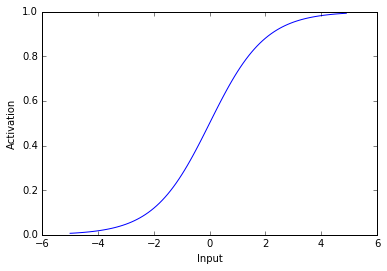
All this is good, but we haven’t actually calculated the output unit’s activity we have only calculated its input. What makes neural networks able to solve complex problems is they include a non-linearity when translating the input into activity. In this case we will translate the input into activity by putting the input through a logistic function.
12
deflogistic(x):#each neuron has a logistic activation functionreturn1.0/(1+np.exp(-x))
Lets take a look at a logistic function.
1234
x=np.arange(-5,5,0.1)#create vector of numbers between -5 and 5plt.plot(x,logistic(x))plt.ylabel('Activation')plt.xlabel('Input');
As you can see above, the logistic used here transforms negative values into values near 0 and positive values into values near 1. Thus, when a unit receives a negative input it has activity near zero and when a unit receives a postitive input it has activity near 1. The most important aspect of this activation function is that its non-linear - it’s not a straight line.
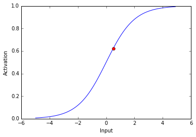
Now lets see the activity of our output neuron. Remember, the net input is 0.5
The activity of our output neuron is depicted as the red dot.
So far I’ve described how to find a unit’s activity, but I haven’t described how to find the weights of connections between units. In the example above, I chose the weights to be 0.25 and 0.5, but I can’t arbitrarily decide weights unless I already know the solution to the problem. If I want the network to find a solution for me, I need the network to find the weights itself.
In order to find the weights of connections between neurons, I will use an algorithm called backpropogation. In backpropogation, we have the neural network guess the answer to a problem and adjust the weights so that this guess gets closer and closer to the correct answer. Backpropogation is the method by which we reduce the distance between guesses and the correct answer. After many iterations of guesses by the neural network and weight adjustments through backpropogation, the network can learn an answer to a problem.
Lets say we want our neural network to give an answer of 0 when the left input unit is active and an answer of 1 when the right unit is active. In this case the inputs I will use are [1,0] and [0,1]. The corresponding correct answers will be [0] and [1].
Lets see how close our network is to the correct answer. I am using the weights from above ([0.25, 0.5]).
1234567891011
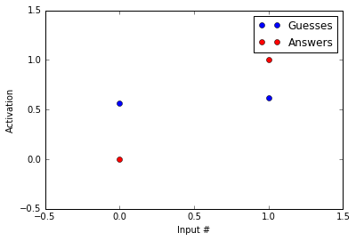
Inputs=[[1,0],[0,1]]Answers=[0,1,]Guesses=[logistic(np.dot(x,Weights))forxinInputs]#loop through inputs and find logistic(sum(input*weights))plt.plot(Guesses,'bo')plt.plot(Answers,'ro')plt.axis([-0.5,1.5,-0.5,1.5])plt.ylabel('Activation')plt.xlabel('Input #')plt.legend(['Guesses','Answers']);printGuesses
[0.56217650088579807, 0.62245933120185459]
The guesses are in blue and the answers are in red. As you can tell, the guesses and the answers look almost nothing alike. Our network likes to guess around 0.6 while the correct answer is 0 in the first example and 1 in the second.
Lets look at how backpropogation reduces the distance between our guesses and the correct answers.
First, we want to know how the amount of error changes with an adjustment to a given weight. We can write this as
This change in error with changes in the weights has a number of different sub components.
Changes in error with changes in the output unit’s activity:
Changes in the output unit’s activity with changes in this unit’s input:
Changes in the output unit’s input with changes in the weight:
This might look scary, but with a little thought it should make sense: (starting with the final term and moving left) When we change the weight of a connection to a unit, we change the input to that unit. When we change the input to a unit, we change its activity (written Output above). When we change a units activity, we change the amount of error.
Let’s break this down using our example. During this portion, I am going to gloss over some details about how exactly to derive the partial derivatives. Wikipedia has a more complete derivation.
In the first example, the input is [1,0] and the correct answer is [0]. Our network’s guess in this example was about 0.56.
Please note that this is specific to our example with a logistic activation function
To summarize:
This is the direction we want to move in, but taking large steps in this direction can prevent us from finding the optimal weights. For this reason, we reduce our step size. We will reduce our step size with a parameter called the learning rate (). is bound between 0 and 1.
We will set to be 0.5. Here is how we will calculate the new .
Thus, is shrinking which will move the output towards 0. Below I write the code to implement our backpropogation.
1234567
alpha=0.5defdelta_Output(target,Output):return-(target-Output)*Output*(1-Output)#find the amount of error and derivative of activation functiondefupdate_weights(alpha,delta,unit_input):returnalpha*np.outer(delta,unit_input)#multiply delta output by all the inputs and then multiply these by the learning rate
Above I use the outer product of our delta function and the input in order to spread the weight changes to all lines connecting to the output unit.
Okay, hopefully you made it through that. I promise thats as bad as it gets. Now that we’ve gotten through the nasty stuff, lets use backpropogation to find an answer to our problem.
1234567891011121314151617181920212223242526272829
defnetwork_guess(Input,Weights):returnlogistic(np.dot(Input,Weights.T))#input by weights then through a logisticdefback_prop(Input,Output,target,Weights):delta=delta_Output(target,Output)#find delta portiondelta_weight=update_weights(alpha,delta,Input)#find amount to update weightsWeights=np.atleast_2d(Weights)#convert weights to arrayWeights+=-delta_weight#update weightsreturnWeightsfromrandomimportchoice,seedseed(1)#seed random number generator so that these results can be replicatedWeights=np.array([0.25,0.5])Error=[]whileTrue:Trial_Type=choice([0,1])#generate random number to choose between the two inputsInput=np.atleast_2d(Inputs[Trial_Type])#choose input and convert to arrayAnswer=Answers[Trial_Type]#get the correct answerOutput=network_guess(Input,Weights)#compute the networks guessWeights=back_prop(Input,Output,Answer,Weights)#change the weights based on the errorError.append(abs(Output-Answer))#record erroriflen(Error)>6andnp.mean(Error[-5:])<0.05:break#tell the code to stop iterating when mean error is < 0.05 in the last 5 guesses
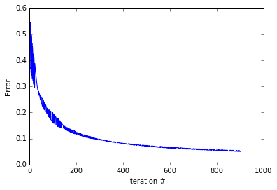
It seems our code has found an answer, so lets see how the amount of error changed as the code progressed.
It looks like the while loop excecuted about 1000 iterations before converging. As you can see the error decreases. Quickly at first then slowly as the weights zone in on the correct answer. lets see how our guesses compare to the correct answers.
1234567891011
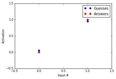
Inputs=[[1,0],[0,1]]Answers=[0,1,]Guesses=[logistic(np.dot(x,Weights.T))forxinInputs]#loop through inputs and find logistic(sum(input*weights))plt.plot(Guesses,'bo')plt.plot(Answers,'ro')plt.axis([-0.5,1.5,-0.5,1.5])plt.ylabel('Activation')plt.xlabel('Input #')plt.legend(['Guesses','Answers']);printGuesses
[array([ 0.05420561]), array([ 0.95020512])]
Not bad! Our guesses are much closer to the correct answers than before we started running the backpropogation procedure! Now, you might say, “HEY! But you haven’t reached the correct answers.” That’s true, but note that acheiving the values of 0 and 1 with a logistic function are only possible at - and , respectively. Because of this, we treat 0.05 as 0 and 0.95 as 1.
Okay, all this is great, but that was a really simple problem, and I said that neural networks could solve interesting problems!
Well… this post is already longer than I anticipated. I will follow-up this post with another post explaining how we can expand neural networks to solve more interesting problems.
After my previous post, I started to get a little worried about my career prediction model. Specifically, I started to wonder about whether my model was underfitting or overfitting the data. Underfitting occurs when the model has too much “bias” and cannot accomodate the data’s shape. Overfitting occurs when the model is too flexible and can account for all variance in a data set - even variance due to noise. In this post, I will quickly re-create my player prediction model, and investigate whether underfitting and overfitting are a problem.
Because this post largely repeats a previous one, I haven’t written quite as much about the code. If you would like to read more about the code, see my previous posts.
As usual, I will post all code as a jupyter notebook on my github.
123456789
#import some libraries and tell ipython we want inline figures rather than interactive figures.importmatplotlib.pyplotasplt,pandasaspd,numpyasnp,matplotlibasmplfrom__future__importprint_function%matplotlibinlinepd.options.display.mpl_style='default'#load matplotlib for plottingplt.style.use('ggplot')#im addicted to ggplot. so pretty.mpl.rcParams['font.family']=['Bitstream Vera Sans']
Load the data. Reminder - this data is still available on my github.
12345678
rookie_df=pd.read_pickle('nba_bballref_rookie_stats_2016_Mar_15.pkl')#here's the rookie year datarook_games=rookie_df['Career Games']>50rook_year=rookie_df['Year']>1980#remove rookies from before 1980 and who have played less than 50 games. I also remove some features that seem irrelevant or unfairrookie_df_games=rookie_df[rook_games&rook_year]#only players with more than 50 games.rookie_df_drop=rookie_df_games.drop(['Year','Career Games','Name'],1)
fromsklearn.preprocessingimportStandardScalerdf=pd.read_pickle('nba_bballref_career_stats_2016_Mar_15.pkl')df=df[df['G']>50]df_drop=df.drop(['Year','Name','G','GS','MP','FG','FGA','FG%','3P','2P','FT','TRB','PTS','ORtg','DRtg','PER','TS%','3PAr','FTr','ORB%','DRB%','TRB%','AST%','STL%','BLK%','TOV%','USG%','OWS','DWS','WS','WS/48','OBPM','DBPM','BPM','VORP'],1)X=df_drop.as_matrix()#take data out of dataframeScaleModel=StandardScaler().fit(X)X=ScaleModel.transform(X)
Use k-means to group players according to their performance. See my post on grouping players for more info.
12345678
fromsklearn.decompositionimportPCAfromsklearn.clusterimportKMeansreduced_model=PCA(n_components=5,whiten=True).fit(X)reduced_data=reduced_model.transform(X)#transform data into the 5 PCA components spacefinal_fit=KMeans(n_clusters=6).fit(reduced_data)#fit 6 clustersdf['kmeans_label']=final_fit.labels_#label each data point with its clusters
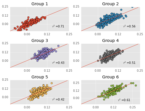
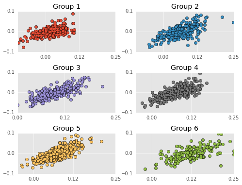
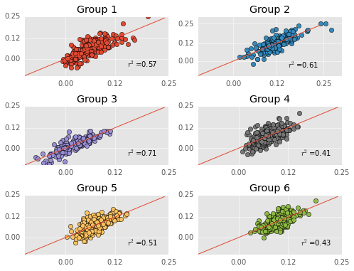
Run a separate regression on each group of players. I calculate mean absolute error (a variant of mean squared error) for each model. I used mean absolute error because it’s on the same scale as the data, and easier to interpret. I will use this later to evaluate just how accurate these models are. Quick reminder - I am trying to predict career WS/48 with MANY predictor variables from rookie year performance such rebounding and scoring statistics.
importstatsmodels.apiassmfromsklearn.metricsimportmean_absolute_error#import function for calculating mean squared error.X=rookie_df.as_matrix()#take data out of dataframecluster_labels=df[df['Year']>1980]['kmeans_label']rookie_df_drop['kmeans_label']=cluster_labels#label each data point with its clustersplt.figure(figsize=(8,6));estHold=[[],[],[],[],[],[]]score=[]fori,groupinenumerate(np.unique(final_fit.labels_)):Grouper=df['kmeans_label']==group#do one regression at a timeYearer=df['Year']>1980Group1=df[Grouper&Yearer]Y=Group1['WS/48']#get predictor dataGroup1_rookie=rookie_df_drop[rookie_df_drop['kmeans_label']==group]Group1_rookie=Group1_rookie.drop(['kmeans_label'],1)#get predicted dataX=Group1_rookie.as_matrix()#take data out of dataframe X=sm.add_constant(X)# Adds a constant term to the predictorest=sm.OLS(Y,X)#fit with linear regression modelest=est.fit()estHold[i]=estscore.append(mean_absolute_error(Y,est.predict(X)))#calculate the mean squared error#print est.summary()plt.subplot(3,2,i+1)#plot each regression's prediction against actual dataplt.plot(est.predict(X),Y,'o',color=plt.rcParams['axes.color_cycle'][i])plt.plot(np.arange(-0.1,0.25,0.01),np.arange(-0.1,0.25,0.01),'-')plt.title('Group %d'%(i+1))plt.text(0.15,-0.05,'$r^2$=%.2f'%est.rsquared)plt.xticks([0.0,0.12,0.25])plt.yticks([0.0,0.12,0.25]);
More quick reminders - predicted performances are on the Y-axis, actual performances are on the X-axis, and the red line is the identity line. Thus far, everything has been exactly the same as my previous post (although my group labels are different).
I want to investigate whether the model is overfitting the data. If the data is overfitting the data, then the error should go up when training and testing with different datasets (because the model was fitting itself to noise and noise changes when the datasets change). To investigate whether the model overfits the data, I will evaluate whether the model “generalizes” via cross-validation.
The reason I’m worried about overfitting is I used a LOT of predictors in these models and the number of predictors might have allowed the model the model to fit noise in the predictors.
12345678910111213141516171819202122232425262728
fromsklearn.linear_modelimportLinearRegression#I am using sklearns linear regression because it plays well with their cross validation functionfromsklearnimportcross_validation#import the cross validation functionX=rookie_df.as_matrix()#take data out of dataframecluster_labels=df[df['Year']>1980]['kmeans_label']rookie_df_drop['kmeans_label']=cluster_labels#label each data point with its clustersfori,groupinenumerate(np.unique(final_fit.labels_)):Grouper=df['kmeans_label']==group#do one regression at a timeYearer=df['Year']>1980Group1=df[Grouper&Yearer]Y=Group1['WS/48']#get predictor dataGroup1_rookie=rookie_df_drop[rookie_df_drop['kmeans_label']==group]Group1_rookie=Group1_rookie.drop(['kmeans_label'],1)#get predicted dataX=Group1_rookie.as_matrix()#take data out of dataframe X=sm.add_constant(X)# Adds a constant term to the predictorest=LinearRegression()#fit with linear regression modelthis_scores=cross_validation.cross_val_score(est,X,Y,cv=10,scoring='mean_absolute_error')#find mean square error across different datasets via cross validationsprint('Group '+str(i))print('Initial Mean Absolute Error: '+str(score[i])[0:6])print('Cross Validation MAE: '+str(np.median(np.abs(this_scores)))[0:6])#find the mean MSE across validations
Group 0
Initial Mean Absolute Error: 0.0161
Cross Validation MAE: 0.0520
Group 1
Initial Mean Absolute Error: 0.0251
Cross Validation MAE: 0.0767
Group 2
Initial Mean Absolute Error: 0.0202
Cross Validation MAE: 0.0369
Group 3
Initial Mean Absolute Error: 0.0200
Cross Validation MAE: 0.0263
Group 4
Initial Mean Absolute Error: 0.0206
Cross Validation MAE: 0.0254
Group 5
Initial Mean Absolute Error: 0.0244
Cross Validation MAE: 0.0665
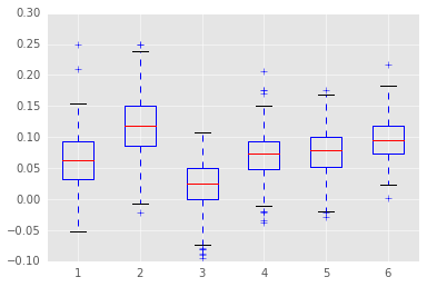
Above I print out the model’s initial mean absolute error and median absolute error when fitting cross-validated data.
The models definitely have more error when cross validated. The change in error is worse in some groups than others. For instance, error dramatically increases in Group 1. Keep in mind that the scoring measure here is mean absolute error, so error is in the same scale as WS/48. An average error of 0.04 in WS/48 is sizable, leaving me worried that the models overfit the data.
Unfortunately, Group 1 is the “scorers” group, so the group with most the interesting players is where the model fails most…
Next, I will look into whether my models underfit the data. I am worried that my models underfit the data because I used linear regression, which has very little flexibility. To investigate this, I will plot the residuals of each model. Residuals are the error between my model’s prediction and the actual performance.
Linear regression assumes that residuals are uncorrelated and evenly distributed around 0. If this is not the case, then the linear regression is underfitting the data.
123456789101112131415161718
#plot the residuals. there's obviously a problem with under/over predictionplt.figure(figsize=(8,6));fori,groupinenumerate(np.unique(final_fit.labels_)):Grouper=df['kmeans_label']==group#do one regression at a timeYearer=df['Year']>1980Group1=df[Grouper&Yearer]Y=Group1['WS/48']#get predictor dataresid=estHold[i].resid#extract residualsplt.subplot(3,2,i+1)#plot each regression's prediction against actual dataplt.plot(Y,resid,'o',color=plt.rcParams['axes.color_cycle'][i])plt.title('Group %d'%(i+1))plt.xticks([0.0,0.12,0.25])plt.yticks([-0.1,0.0,0.1]);
Residuals are on the Y-axis and career performances are on the X-axis. Negative residuals are over predictions (the player is worse than my model predicts) and postive residuals are under predictions (the player is better than my model predicts). I don’t test this, but the residuals appear VERY correlated. That is, the model tends to over estimate bad players (players with WS/48 less than 0.0) and under estimate good players. Just to clarify, non-correlated residuals would have no apparent slope.
This means the model is making systematic errors and not fitting the actual shape of the data. I’m not going to say the model is damned, but this is an obvious sign that the model needs more flexibility.
No model is perfect, but this model definitely needs more work. I’ve been playing with more flexible models and will post these models here if they do a better job predicting player performance.
As a huge t-wolves fan, I’ve been curious all year by what we can infer from Karl-Anthony Towns’ great rookie season. To answer this question, I’ve create a simple linear regression model that uses rookie year performance to predict career performance.
Many have attempted to predict NBA players’ success via regression style approaches. Notable models I know of include Layne Vashro’s model which uses combine and college performance to predict career performance. Layne Vashro’s model is a quasi-poisson GLM. I tried a similar approach, but had the most success when using ws/48 and OLS. I will discuss this a little more at the end of the post.
A jupyter notebook of this post can be found on my github.
123456789
#import some libraries and tell ipython we want inline figures rather than interactive figures.importmatplotlib.pyplotasplt,pandasaspd,numpyasnp,matplotlibasmplfrom__future__importprint_function%matplotlibinlinepd.options.display.mpl_style='default'#load matplotlib for plottingplt.style.use('ggplot')#im addicted to ggplot. so pretty.mpl.rcParams['font.family']=['Bitstream Vera Sans']
I collected all the data for this project from basketball-reference.com. I posted the functions for collecting the data on my github. The data is also posted there. Beware, the data collection scripts take awhile to run.
This data includes per 36 stats and advanced statistics such as usage percentage. I simply took all the per 36 and advanced statistics from a player’s page on basketball-reference.com.
12
df=pd.read_pickle('nba_bballref_career_stats_2016_Mar_15.pkl')#here's the career data.rookie_df=pd.read_pickle('nba_bballref_rookie_stats_2016_Mar_15.pkl')#here's the rookie year data
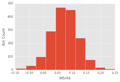
The variable I am trying to predict is average WS/48 over a player’s career. There’s no perfect box-score statistic when it comes to quantifying a player’s peformance, but ws/48 seems relatively solid.
12345678
Games=df['G']>50#only using players who played in more than 50 games.Year=df['Year']>1980#only using players after 1980 when they started keeping many important records such as games startedY=df[Games&Year]['WS/48']#predicted variableplt.hist(Y);plt.ylabel('Bin Count')plt.xlabel('WS/48');
The predicted variable looks pretty gaussian, so I can use ordinary least squares. This will be nice because while ols is not flexible, it’s highly interpretable. At the end of the post I’ll mention some more complex models that I will try.
123456
rook_games=rookie_df['Career Games']>50rook_year=rookie_df['Year']>1980#remove rookies from before 1980 and who have played less than 50 games. I also remove some features that seem irrelevant or unfairrookie_df_games=rookie_df[rook_games&rook_year]#only players with more than 50 games.rookie_df_drop=rookie_df_games.drop(['Year','Career Games','Name'],1)
Above, I remove some predictors from the rookie data. Lets run the regression!
12345678
importstatsmodels.apiassmX_rookie=rookie_df_drop.as_matrix()#take data out of dataframeX_rookie=sm.add_constant(X_rookie)# Adds a constant term to the predictorestAll=sm.OLS(Y,X_rookie)#create ordinary least squares modelestAll=estAll.fit()#fit the modelprint(estAll.summary())
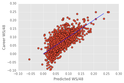
There’s a lot to look at in the regression output (especially with this many features). For an explanation of all the different parts of the regression take a look at this post. Below is a quick plot of predicted ws/48 against actual ws/48.
The blue line above is NOT the best-fit line. It’s the identity line. I plot it to help visualize where the model fails. The model seems to primarily fail in the extremes - it tends to overestimate the worst players.
All in all, This model does a remarkably good job given its simplicity (linear regression), but it also leaves a lot of variance unexplained.
One reason this model might miss some variance is there’s more than one way to be a productive basketball player. For instance, Dwight Howard and Steph Curry find very different ways to contribute. One linear regression model is unlikely to succesfully predict both players.
In a previous post, I grouped players according to their on-court performance. These player groupings might help predict career performance.
Below, I will use the same player grouping I developed in my previous post, and examine how these groupings impact my ability to predict career performance.
12345678
fromsklearn.preprocessingimportStandardScalerdf=pd.read_pickle('nba_bballref_career_stats_2016_Mar_15.pkl')df=df[df['G']>50]df_drop=df.drop(['Year','Name','G','GS','MP','FG','FGA','FG%','3P','2P','FT','TRB','PTS','ORtg','DRtg','PER','TS%','3PAr','FTr','ORB%','DRB%','TRB%','AST%','STL%','BLK%','TOV%','USG%','OWS','DWS','WS','WS/48','OBPM','DBPM','BPM','VORP'],1)X=df_drop.as_matrix()#take data out of dataframeScaleModel=StandardScaler().fit(X)X=ScaleModel.transform(X)
12345678
fromsklearn.decompositionimportPCAfromsklearn.clusterimportKMeansreduced_model=PCA(n_components=5,whiten=True).fit(X)reduced_data=reduced_model.transform(X)#transform data into the 5 PCA components spacefinal_fit=KMeans(n_clusters=6).fit(reduced_data)#fit 6 clustersdf['kmeans_label']=final_fit.labels_#label each data point with its clusters
See my other post for more details about this clustering procedure.
Let’s see how WS/48 varies across the groups.
12
WS_48=[df[df['kmeans_label']==x]['WS/48']forxinnp.unique(df['kmeans_label'])]#create a vector of ws/48. One for each clusterplt.boxplot(WS_48);
Some groups perform better than others, but there’s lots of overlap between the groups. Importantly, each group has a fair amount of variability. Each group spans at least 0.15 WS/48. This gives the regression enough room to successfully predict performance in each group.
Now, lets get a bit of a refresher on what the groups are. Again, my previous post has a good description of these groups.
1234567891011121314151617
TS=[np.mean(df[df['kmeans_label']==x]['TS%'])*100forxinnp.unique(df['kmeans_label'])]#create vectors of each stat for each clusterThreeAr=[np.mean(df[df['kmeans_label']==x]['3PAr'])*100forxinnp.unique(df['kmeans_label'])]FTr=[np.mean(df[df['kmeans_label']==x]['FTr'])*100forxinnp.unique(df['kmeans_label'])]RBD=[np.mean(df[df['kmeans_label']==x]['TRB%'])forxinnp.unique(df['kmeans_label'])]AST=[np.mean(df[df['kmeans_label']==x]['AST%'])forxinnp.unique(df['kmeans_label'])]STL=[np.mean(df[df['kmeans_label']==x]['STL%'])forxinnp.unique(df['kmeans_label'])]TOV=[np.mean(df[df['kmeans_label']==x]['TOV%'])forxinnp.unique(df['kmeans_label'])]USG=[np.mean(df[df['kmeans_label']==x]['USG%'])forxinnp.unique(df['kmeans_label'])]Data=np.array([TS,ThreeAr,FTr,RBD,AST,STL,TOV,USG])ind=np.arange(1,9)plt.figure(figsize=(16,8))plt.plot(ind,Data,'o-',linewidth=2)plt.xticks(ind,('True Shooting','3 point Attempt','Free Throw Rate','Rebound','Assist','Steal','TOV','Usage'),rotation=45)plt.legend(('Group 1','Group 2','Group 3','Group 4','Group 5','Group 6'))plt.ylabel('Percent');
I’ve plotted the groups across a number of useful categories. For information about these categories see basketball reference’s glossary.
Here’s a quick rehash of the groupings. See my previous post for more detail.
**Group 1:** These are the distributors who shoot a fair number of threes, don't rebound at all, dish out assists, gather steals, and ...turn the ball over.
**Group 2:** These are the scorers who get to the free throw line, dish out assists, and carry a high usage.
**Group 3:** These are the bench players who don't score...or do much in general.
**Group 4:** These are the 3 point shooters who shoot tons of 3 pointers, almost no free throws, and don't rebound well.
**Group 5:** These are the mid-range shooters who shoot well, but don't shoot threes or draw free throws
**Group 6:** These are the defensive big men who shoot no threes, rebound lots, and carry a low usage.
On to the regression.
12345678
rookie_df=pd.read_pickle('nba_bballref_rookie_stats_2016_Mar_15.pkl')rookie_df=rookie_df.drop(['Year','Career Games','Name'],1)X=rookie_df.as_matrix()#take data out of dataframeScaleRookie=StandardScaler().fit(X)#scale dataX=ScaleRookie.transform(X)#transform data to scalereduced_model_rookie=PCA(n_components=10).fit(X)#create pca model of first 10 components.
You might have noticed the giant condition number in the regression above. This indicates significant multicollinearity of the features, which isn’t surprising since I have many features that reflect the same abilities.
The multicollinearity doesn’t prevent the regression model from making accurate predictions, but does it make the beta weight estimates irratic. With irratic beta weights, it’s hard to tell whether the different clusters use different models when predicting career ws/48.
In the following regression, I put the predicting features through a PCA and keep only the first 10 PCA components. Using only the first 10 PCA components keeps the component score below 20, indicating that multicollinearity is not a problem. I then examine whether the different groups exhibit a different patterns of beta weights (whether different models predict success of the different groups).
1234567891011121314151617181920212223242526
cluster_labels=df[df['Year']>1980]['kmeans_label']#limit labels to players after 1980rookie_df_drop['kmeans_label']=cluster_labels#label each data point with its clustersestHold=[[],[],[],[],[],[]]fori,groupinenumerate(np.unique(final_fit.labels_)):Grouper=df['kmeans_label']==group#do regression one group at a timeYearer=df['Year']>1980Group1=df[Grouper&Yearer]Y=Group1['WS/48']#get predicted dataGroup1_rookie=rookie_df_drop[rookie_df_drop['kmeans_label']==group]#get predictor data of groupGroup1_rookie=Group1_rookie.drop(['kmeans_label'],1)X=Group1_rookie.as_matrix()#take data out of dataframeX=ScaleRookie.transform(X)#scale dataX=reduced_model_rookie.transform(X)#transform data into the 10 PCA components spaceX=sm.add_constant(X)# Adds a constant term to the predictorest=sm.OLS(Y,X)#create regression modelest=est.fit()#print(est.summary())estHold[i]=est
Above I plot the beta weights for each principle component across the groupings. This plot is a lot to look at, but I wanted to depict how the beta values changed across the groups. They are not drastically different, but they’re also not identical. Error bars depict 95% confidence intervals.
Below I fit a regression to each group, but with all the features. Again, multicollinearity will be a problem, but this will not decrease the regression’s accuracy, which is all I really care about.
X=rookie_df.as_matrix()#take data out of dataframecluster_labels=df[df['Year']>1980]['kmeans_label']rookie_df_drop['kmeans_label']=cluster_labels#label each data point with its clustersplt.figure(figsize=(8,6));estHold=[[],[],[],[],[],[]]fori,groupinenumerate(np.unique(final_fit.labels_)):Grouper=df['kmeans_label']==group#do one regression at a timeYearer=df['Year']>1980Group1=df[Grouper&Yearer]Y=Group1['WS/48']#get predictor dataGroup1_rookie=rookie_df_drop[rookie_df_drop['kmeans_label']==group]Group1_rookie=Group1_rookie.drop(['kmeans_label'],1)#get predicted dataX=Group1_rookie.as_matrix()#take data out of dataframe X=sm.add_constant(X)# Adds a constant term to the predictorest=sm.OLS(Y,X)#fit with linear regression modelest=est.fit()estHold[i]=est#print est.summary()plt.subplot(3,2,i+1)#plot each regression's prediction against actual dataplt.plot(est.predict(X),Y,'o',color=plt.rcParams['axes.color_cycle'][i])plt.plot(np.arange(-0.1,0.25,0.01),np.arange(-0.1,0.25,0.01),'-')plt.title('Group %d'%(i+1))plt.text(0.15,-0.05,'$r^2$=%.2f'%est.rsquared)plt.xticks([0.0,0.12,0.25])plt.yticks([0.0,0.12,0.25]);
The plots above depict each regression’s predictions against actual ws/48. I provide each model’s r^2 in the plot too.
Some regressions are better than others. For instance, the regression model does a pretty awesome job predicting the bench warmers…I wonder if this is because they have shorter careers… The regression model does not do a good job predicting the 3-point shooters.
Now onto the fun stuff though.
Below, create a function for predicting a players career WS/48. First, I write a function that finds what cluster a player would belong to, and what the regression model predicts for this players career (with 95% confidence intervals).
123456789101112131415161718
defplayer_prediction__regressionModel(PlayerName):fromstatsmodels.sandbox.regression.predstdimportwls_prediction_stdclust_df=pd.read_pickle('nba_bballref_career_stats_2016_Mar_05.pkl')clust_df=clust_df[clust_df['Name']==PlayerName]clust_df=clust_df.drop(['Name','G','GS','MP','FG','FGA','FG%','3P','2P','FT','TRB','PTS','ORtg','DRtg','PER','TS%','3PAr','FTr','ORB%','DRB%','TRB%','AST%','STL%','BLK%','TOV%','USG%','OWS','DWS','WS','WS/48','OBPM','DBPM','BPM','VORP'],1)new_vect=ScaleModel.transform(clust_df.as_matrix()[0])reduced_data=reduced_model.transform(new_vect)Group=final_fit.predict(reduced_data)clust_df['kmeans_label']=Group[0]Predrookie_df=pd.read_pickle('nba_bballref_rookie_stats_2016_Mar_15.pkl')Predrookie_df=Predrookie_df[Predrookie_df['Name']==PlayerName]Predrookie_df=Predrookie_df.drop(['Year','Career Games','Name'],1)predX=Predrookie_df.as_matrix()#take data out of dataframepredX=sm.add_constant(predX,has_constant='add')# Adds a constant term to the predictorprstd_ols,iv_l_ols,iv_u_ols=wls_prediction_std(estHold[Group[0]],predX,alpha=0.05)return{'Name':PlayerName,'Group':Group[0]+1,'Prediction':estHold[Group[0]].predict(predX),'Upper_CI':iv_u_ols,'Lower_CI':iv_l_ols}
Here I create a function that creates a list of all the first round draft picks from a given year.
Below I create predictions for each first-round draft pick from 2015. The spurs’ first round pick, Nikola Milutinov, has yet to play so I do not create a prediction for him.
123456789101112131415161718192021222324252627
importmatplotlib.patchesasmpatchesdraft_df=gather_draftData(2015)draft_df['Name'][14]='Kelly Oubre Jr.'#annoying name inconsistenciesplt.subplots(figsize=(14,6));plt.xticks(range(1,31),draft_df['Name'],rotation=90)draft_df=draft_df.drop(17,0)#Sam Dekker has received little playing time making his prediction highly erraticdraft_df=draft_df.drop(25,0)#spurs' 1st round pick has not played yetfornameindraft_df['Name']:draft_num=draft_df[draft_df['Name']==name]['Number']predict_dict=player_prediction__regressionModel(name)yerr=(predict_dict['Upper_CI']-predict_dict['Lower_CI'])/2plt.errorbar(draft_num,predict_dict['Prediction'],fmt='o',label=name,color=plt.rcParams['axes.color_cycle'][predict_dict['Group']-1],yerr=yerr);plt.xlim(left=0,right=31)patch=[mpatches.Patch(color=plt.rcParams['axes.color_cycle'][i],label='Group %d'%(i+1))foriinrange(6)]plt.legend(handles=patch,ncol=3)plt.ylabel('Predicted WS/48')plt.xlabel('Draft Position');
The plot above is ordered by draft pick. The error bars depict 95% confidence interbals…which are a little wider than I would like. It’s interesting to look at what clusters these players fit into. Lots of 3-pt shooters! It could be that rookies play a limited role in the offense - just shooting 3s.
As a t-wolves fan, I am relatively happy about the high prediction for Karl-Anthony Towns. His predicted ws/48 is between Marc Gasol and Elton Brand. Again, the CIs are quite wide, so the model says there’s a 95% chance he is somewhere between Lebron James ever and a player that averages less than 0.1 ws/48.
Karl-Anthony Towns would have the highest predicted ws/48 if it were not for Kevin Looney who the model loves. Kevin Looney has not seen much playing time though, which likely makes his prediction more erratic. Keep in mind I did not use draft position as a predictor in the model.
Sam Dekker has a pretty huge error bar, likely because of his limited playing time this year.
While I fed a ton of features into this model, it’s still just a linear regression. The simplicity of the model might prevent me from making more accurate predictions.
I’ve already started playing with some more complex models. If those work out well, I will post them here. I ended up sticking with a plain linear regression because my vast number of features is a little unwieldy in a more complex models. If you’re interested (and the models produce better results) check back in the future.
For now, these models explain between 40 and 70% of the variance in career ws/48 from only a player’s rookie year. Even predicting 30% of variance is pretty remarkable, so I don’t want to trash on this part of the model. Explaining 65% of the variance is pretty awesome. The model gives us a pretty accurate idea of how these “bench players” will perform. For instance, the future does not look bright for players like Emmanuel Mudiay and Tyus Jones. Not to say these players are doomed. The model assumes that players will retain their grouping for the entire career. Emmanuel Mudiay and Tyus Jones might start performing more like distributors as their career progresses. This could result in a better career.
One nice part about this model is it tells us where the predictions are less confident. For instance, it is nice to know that we’re relatively confident when predicting bench players, but not when we’re predicting 3-point shooters.
For those curious, I output each groups regression summary below.
If you’re just finding this post, please check out Erik Marsja’s post describing the same functionality in well-maintained python software that wasn’t available when I originally wrote this post.
I love doing data analyses with pandas, numpy, sci-py etc., but I often need to run repeated measures ANOVAs, which are not implemented in any major python libraries. Python Psychologist shows how to do repeated measures ANOVAs yourself in python, but I find using a widley distributed implementation comforting…
In this post I show how to execute a repeated measures ANOVAs using the rpy2 library, which allows us to move data between python and R, and execute R commands from python. I use rpy2 to load the car library and run the ANOVA.
I will show how to run a one-way repeated measures ANOVA and a two-way repeated measures ANOVA.
12345678910
#first import the libraries I always use.importnumpyasnp,scipy.stats,pandasaspdimportmatplotlibasmplimportmatplotlib.pyplotaspltimportpylabaspl%matplotlibinlinepd.options.display.mpl_style='default'plt.style.use('ggplot')mpl.rcParams['font.family']=['Bitstream Vera Sans']
Below I use the random library to generate some fake data. I seed the random number generator with a one so that this analysis can be replicated.
I will generated 3 conditions which represent 3 levels of a single variable.
The data are generated from a gaussian distribution. The second condition has a higher mean than the other two conditions.
123456789
importrandomrandom.seed(1)#seed random number generatorcond_1=[random.gauss(600,30)forxinrange(30)]#condition 1 has a mean of 600 and standard deviation of 30cond_2=[random.gauss(650,30)forxinrange(30)]#u=650 and sd=30cond_3=[random.gauss(600,30)forxinrange(30)]#u=600 and sd=30plt.bar(np.arange(1,4),[np.mean(cond_1),np.mean(cond_2),np.mean(cond_3)],align='center')#plot dataplt.xticks([1,2,3]);
Next, I load rpy2 for ipython. I am doing these analyses with ipython in a jupyter notebook (highly recommended).
1
%load_extrpy2.ipython
Here’s how to run the ANOVA. Note that this is a one-way anova with 3 levels of the factor.
1234567891011121314151617181920212223
#pop the data into R%Rpushcond_1cond_2cond_3#label the conditions%RFactor<-c('Cond1','Cond2','Cond3')#create a vector of conditions%Ridata<-data.frame(Factor)#combine data into single matrix%RBind<-cbind(cond_1,cond_2,cond_3)#generate linear model%Rmodel<-lm(Bind~1)#load the car library. note this library must be installed.%Rlibrary(car)#run anova%Ranalysis<-Anova(model,idata=idata,idesign=~Factor,type="III")#create anova summary table%Ranova_sum=summary(analysis)#move the data from R to python%Rpullanova_sumprintanova_sum
Type III Repeated Measures MANOVA Tests:

------------------------------------------

Term: (Intercept)

 Response transformation matrix:
       (Intercept)
cond_1           1
cond_2           1
cond_3           1

Sum of squares and products for the hypothesis:
            (Intercept)
(Intercept)   102473990

Sum of squares and products for error:
            (Intercept)
(Intercept)     78712.7

Multivariate Tests: (Intercept)
                 Df test stat approx F num Df den Df     Pr(>F)
Pillai            1    0.9992 37754.33      1     29 < 2.22e-16 ***
Wilks             1    0.0008 37754.33      1     29 < 2.22e-16 ***
Hotelling-Lawley  1 1301.8736 37754.33      1     29 < 2.22e-16 ***
Roy               1 1301.8736 37754.33      1     29 < 2.22e-16 ***
---
Signif. codes:  0 ‘***’ 0.001 ‘**’ 0.01 ‘*’ 0.05 ‘.’ 0.1 ‘ ’ 1

------------------------------------------

Term: Factor

 Response transformation matrix:
       Factor1 Factor2
cond_1       1       0
cond_2       0       1
cond_3      -1      -1

Sum of squares and products for the hypothesis:
          Factor1   Factor2
Factor1  3679.584  19750.87
Factor2 19750.870 106016.58

Sum of squares and products for error:
         Factor1  Factor2
Factor1 40463.19 27139.59
Factor2 27139.59 51733.12

Multivariate Tests: Factor
                 Df test stat approx F num Df den Df    Pr(>F)
Pillai            1 0.7152596 35.16759      2     28 2.303e-08 ***
Wilks             1 0.2847404 35.16759      2     28 2.303e-08 ***
Hotelling-Lawley  1 2.5119704 35.16759      2     28 2.303e-08 ***
Roy               1 2.5119704 35.16759      2     28 2.303e-08 ***
---
Signif. codes:  0 ‘***’ 0.001 ‘**’ 0.01 ‘*’ 0.05 ‘.’ 0.1 ‘ ’ 1

Univariate Type III Repeated-Measures ANOVA Assuming Sphericity

                  SS num Df Error SS den Df         F    Pr(>F)
(Intercept) 34157997      1    26238     29 37754.334 < 2.2e-16 ***
Factor         59964      2    43371     58    40.094 1.163e-11 ***
---
Signif. codes:  0 ‘***’ 0.001 ‘**’ 0.01 ‘*’ 0.05 ‘.’ 0.1 ‘ ’ 1


Mauchly Tests for Sphericity

       Test statistic p-value
Factor        0.96168 0.57866


Greenhouse-Geisser and Huynh-Feldt Corrections
 for Departure from Sphericity

        GG eps Pr(>F[GG])
Factor 0.96309  2.595e-11 ***
---
Signif. codes:  0 ‘***’ 0.001 ‘**’ 0.01 ‘*’ 0.05 ‘.’ 0.1 ‘ ’ 1

        HF eps   Pr(>F[HF])
Factor 1.03025 1.163294e-11
The ANOVA table isn’t pretty, but it works. As you can see, the ANOVA was wildly significant.
Next, I generate data for a two-way (2x3) repeated measures ANOVA. Condition A is the same data as above. Condition B has a different pattern (2 is lower than 1 and 3), which should produce an interaction.
%Rpushcond_1acond_1bcond_2acond_2bcond_3acond_3b%RFactor1<-c('A','A','A','B','B','B')%RFactor2<-c('Cond1','Cond2','Cond3','Cond1','Cond2','Cond3')%Ridata<-data.frame(Factor1,Factor2)#make sure the vectors appear in the same order as they appear in the dataframe%RBind<-cbind(cond_1a,cond_2a,cond_3a,cond_1b,cond_2b,cond_3b)%Rmodel<-lm(Bind~1)%Rlibrary(car)%Ranalysis<-Anova(model,idata=idata,idesign=~Factor1*Factor2,type="III")%Ranova_sum=summary(analysis)%Rpullanova_sumprintanova_sum
Type III Repeated Measures MANOVA Tests:

------------------------------------------

Term: (Intercept)

 Response transformation matrix:
        (Intercept)
cond_1a           1
cond_2a           1
cond_3a           1
cond_1b           1
cond_2b           1
cond_3b           1

Sum of squares and products for the hypothesis:
            (Intercept)
(Intercept)   401981075

Sum of squares and products for error:
            (Intercept)
(Intercept)    185650.5

Multivariate Tests: (Intercept)
                 Df test stat approx F num Df den Df     Pr(>F)
Pillai            1    0.9995 62792.47      1     29 < 2.22e-16 ***
Wilks             1    0.0005 62792.47      1     29 < 2.22e-16 ***
Hotelling-Lawley  1 2165.2575 62792.47      1     29 < 2.22e-16 ***
Roy               1 2165.2575 62792.47      1     29 < 2.22e-16 ***
---
Signif. codes:  0 ‘***’ 0.001 ‘**’ 0.01 ‘*’ 0.05 ‘.’ 0.1 ‘ ’ 1

------------------------------------------

Term: Factor1

 Response transformation matrix:
        Factor11
cond_1a        1
cond_2a        1
cond_3a        1
cond_1b       -1
cond_2b       -1
cond_3b       -1

Sum of squares and products for the hypothesis:
         Factor11
Factor11 38581.51

Sum of squares and products for error:
         Factor11
Factor11 142762.3

Multivariate Tests: Factor1
                 Df test stat approx F num Df den Df    Pr(>F)
Pillai            1 0.2127533 7.837247      1     29 0.0090091 **
Wilks             1 0.7872467 7.837247      1     29 0.0090091 **
Hotelling-Lawley  1 0.2702499 7.837247      1     29 0.0090091 **
Roy               1 0.2702499 7.837247      1     29 0.0090091 **
---
Signif. codes:  0 ‘***’ 0.001 ‘**’ 0.01 ‘*’ 0.05 ‘.’ 0.1 ‘ ’ 1

------------------------------------------

Term: Factor2

 Response transformation matrix:
        Factor21 Factor22
cond_1a        1        0
cond_2a        0        1
cond_3a       -1       -1
cond_1b        1        0
cond_2b        0        1
cond_3b       -1       -1

Sum of squares and products for the hypothesis:
         Factor21 Factor22
Factor21 91480.01 77568.78
Factor22 77568.78 65773.02

Sum of squares and products for error:
         Factor21 Factor22
Factor21 90374.60 56539.06
Factor22 56539.06 87589.85

Multivariate Tests: Factor2
                 Df test stat approx F num Df den Df    Pr(>F)
Pillai            1 0.5235423 15.38351      2     28 3.107e-05 ***
Wilks             1 0.4764577 15.38351      2     28 3.107e-05 ***
Hotelling-Lawley  1 1.0988223 15.38351      2     28 3.107e-05 ***
Roy               1 1.0988223 15.38351      2     28 3.107e-05 ***
---
Signif. codes:  0 ‘***’ 0.001 ‘**’ 0.01 ‘*’ 0.05 ‘.’ 0.1 ‘ ’ 1

------------------------------------------

Term: Factor1:Factor2

 Response transformation matrix:
        Factor11:Factor21 Factor11:Factor22
cond_1a                 1                 0
cond_2a                 0                 1
cond_3a                -1                -1
cond_1b                -1                 0
cond_2b                 0                -1
cond_3b                 1                 1

Sum of squares and products for the hypothesis:
                  Factor11:Factor21 Factor11:Factor22
Factor11:Factor21          179585.9            384647
Factor11:Factor22          384647.0            823858

Sum of squares and products for error:
                  Factor11:Factor21 Factor11:Factor22
Factor11:Factor21          92445.33          45639.49
Factor11:Factor22          45639.49          89940.37

Multivariate Tests: Factor1:Factor2
                 Df test stat approx F num Df den Df     Pr(>F)
Pillai            1  0.901764 128.5145      2     28 7.7941e-15 ***
Wilks             1  0.098236 128.5145      2     28 7.7941e-15 ***
Hotelling-Lawley  1  9.179605 128.5145      2     28 7.7941e-15 ***
Roy               1  9.179605 128.5145      2     28 7.7941e-15 ***
---
Signif. codes:  0 ‘***’ 0.001 ‘**’ 0.01 ‘*’ 0.05 ‘.’ 0.1 ‘ ’ 1

Univariate Type III Repeated-Measures ANOVA Assuming Sphericity

                      SS num Df Error SS den Df          F    Pr(>F)
(Intercept)     66996846      1    30942     29 62792.4662 < 2.2e-16 ***
Factor1             6430      1    23794     29     7.8372  0.009009 **
Factor2            26561      2    40475     58    19.0310  4.42e-07 ***
Factor1:Factor2   206266      2    45582     58   131.2293 < 2.2e-16 ***
---
Signif. codes:  0 ‘***’ 0.001 ‘**’ 0.01 ‘*’ 0.05 ‘.’ 0.1 ‘ ’ 1


Mauchly Tests for Sphericity

                Test statistic p-value
Factor2                0.96023 0.56654
Factor1:Factor2        0.99975 0.99648


Greenhouse-Geisser and Huynh-Feldt Corrections
 for Departure from Sphericity

                 GG eps Pr(>F[GG])
Factor2         0.96175  6.876e-07 ***
Factor1:Factor2 0.99975  < 2.2e-16 ***
---
Signif. codes:  0 ‘***’ 0.001 ‘**’ 0.01 ‘*’ 0.05 ‘.’ 0.1 ‘ ’ 1

                  HF eps   Pr(>F[HF])
Factor2         1.028657 4.420005e-07
Factor1:Factor2 1.073774 2.965002e-22
Again, the anova table isn’t too pretty.
This obviously isn’t the most exciting post in the world, but its a nice bit of code to have in your back pocket if you’re doing experimental analyses in python.
In basketball, we typically talk about 5 positions: point guard, shooting guard, small forward, power forward, and center. Based on this, one might expect NBA players to fall into 5 distinct groups- Point guards perform similar to other point guards, shooting guards perform similar to other shooting guards, etc. Is this the case? Do NBA players fall neatly into position groups?
To answer this question, I will look at how NBA players “group” together. For example, there might be a group of players who collect lots of rebounds, shoot poorly from behind the 3 point line, and block lots of shots. I might call these players forwards. If we allow player performance to create groups, what will these groups look like?
To group players, I will use k-means clustering (https://en.wikipedia.org/wiki/K-means_clustering).
When choosing a clustering algorithm, its important to think about how the clustering algorithm defines clusters. k-means minimizes the distance between data points (players in my case) and the center of K different points. Because distance is between the cluster center and a given point, k-means assumes clusters are spherical. When thinking about clusters of NBA players, do I think these clusters will be spherical? If not, then I might want try a different clustering algorithm.
For now, I will assume generally spherical clusters and use k-means. At the end of this post, I will comment on whether this assumption seems valid.
1234567
#import libraries and tell ipython we want inline figures rather than interactive figures.importmatplotlib.pyplotasplt,pandasaspd,numpyasnp,matplotlibasmpl,requests,time%matplotlibinlinepd.options.display.mpl_style='default'#load matplotlib for plottingplt.style.use('ggplot')#im addicted to ggplot. so pretty.mpl.rcParams['font.family']=['Bitstream Vera Sans']
We need data. Collecting the data will require a couple steps. First, I will create a matrix of all players who ever played in the NBA (via the NBA.com API).
123456
url='http://stats.nba.com/stats/commonallplayers?IsOnlyCurrentSeason=0&LeagueID=00&Season=2015-16'# the critical part of the URL is IsOnlyCurrentSeason=0. The 0 means all seasons.response=requests.get(url)#get dataheaders=response.json()['resultSets'][0]players=response.json()['resultSets'][0]['rowSet']players_df=pd.DataFrame(players,columns=headers['headers'])#turn data into dataframe
In the 1979-1980 season, the NBA started using the 3-point line. The 3-point has dramatically changed basketball, so players performed different before it. While this change in play was not instantaneous, it does not make sense to include players before the 3-point line.
12
players_df['TO_YEAR']=players_df['TO_YEAR'].apply(lambdax:int(x))#change data in the TO_YEAR column from strings to numbersplayers_df=players_df[players_df['TO_YEAR']>1979]#only use players after 3 pt line
I have a list of all the players after 1979, but I want data about all these players. When grouping the players, I am not interested in how much a player played. Instead, I want to know HOW a player played. To remove variability associated with playing time, I will gather data that is standardized for 36 minutes of play. For example, if a player averages 4 points and 12 minutes a game, this player averages 12 points per 36 minutes.
Below, I have written a function that will collect every player’s performance per 36 minutes. The function collects data one player at a time, so its VERY slow. If you want the data, it can be found on my github (https://github.com/dvatterott/nba_project).
defcareerPer36(playerID):url='http://stats.nba.com/stats/playercareerstats?LeagueID=00&PerMode=Per36&PlayerID='+str(playerID)header_data={#I pulled this header from the py goldsberry library'Accept-Encoding':'gzip, deflate, sdch','Accept-Language':'en-US,en;q=0.8','Upgrade-Insecure-Requests':'1','User-Agent':'Mozilla/5.0 (Windows NT 10.0; WOW64)'\
' AppleWebKit/537.36 (KHTML, like Gecko) Chrome/48.0.2564.82 '\
'Safari/537.36','Accept':'text/html,application/xhtml+xml,application/xml;q=0.9'\
',image/webp,*/*;q=0.8','Cache-Control':'max-age=0','Connection':'keep-alive'}try:response=requests.get(url,headers=header_data)#get the data#print playerID #testing purposesexcept:time.sleep(5)#sometime the nba api gets mad about all the requests, so i take a quick breakresponse=requests.get(url,headers=header_data)headers=response.json()['resultSets'][1]#find headersplayers=response.json()['resultSets'][1]['rowSet']#actual dataplayers_df=pd.DataFrame(players,columns=headers['headers'])#create dataframereturnplayers_df#df = pd.DataFrame()#player_list = players_df['PERSON_ID']#df = df.append([careerPer36(x) for x in player_list]) #BEWARE. this takes forever.#df.index = range(np.size(df,0))#df.to_pickle('nba_career_stats_'+time.strftime("%Y_%b_%d", time.gmtime())+'.pkl')df=pd.read_pickle('nba_career_stats_2016_Feb_14.pkl')
Great! Now we have data that is scaled for 36 minutes of play (per36 data) from every player between 1979 and 2016. Above, I printed out the columns. I don’t want all this data. For instance, I do not care about how many minutes a player played. Also, some of the data is redundant. For instance, if I know a player’s field goal attempts (FGA) and field goal percentage (FG_PCT), I can calculate the number of made field goals (FGM). I removed the data columns that seem redundant. I do this because I do not want redundant data exercising too much influence on the grouping process.
Below, I create new data columns for 2 point field goal attempts and 2 point field goal percentage. I also remove all players who played less than 50 games. I do this because these players have not had the opportunity to establish consistent performance.
1234567
df=df[df['GP']>50]#only players with more than 50 games.df=df.fillna(0)#some players have "None" in some cells. Turn these into 0sdf['FG2M']=df['FGM']-df['FG3M']#find number of 2pt field goalsdf['FG2A']=df['FGA']-df['FG3A']#2 point field goal attemptsdf['FG2_PCT']=df['FG2M']/df['FG2A']#2 point field goal percentagesaveIDs=df['PLAYER_ID']#save player IDs for laterdf=df.drop(['PLAYER_ID','LEAGUE_ID','TEAM_ID','GP','GS','MIN','FGM','FGA','FG_PCT','FG3M','FTM','REB','PTS','FG2M'],1)#pull out unncessary columns
It’s always important to visualize the data, so lets get an idea what we’re working with!
The plot below is called a scatter matrix. This type of plot will appear again, so lets go through it carefully. Each subplot has the feature (stat) labeled on its row which serves as its y-axis. The column feature serves as the x-axis. For example the subplot in the second column of the first row plots 3-point field goal attempts by 3-point field goal percentage. As you can see, players that have higher 3-point percentages tend to take more 3-pointers… makes sense.
On the diagonals, I plot the Kernel Density Estimation for the sample histogram. More players fall into areas where where the line is higher on the y-axis. For instance, no players shoot better than ~45% from behind the 3 point line.
One interesting part about scatter matrices is the plots below the diagonal are a reflection of the plots above the diagonal. For example, the data in the second column of the first row and the first column of the second row are the same. The only difference is the axes have switched.
123
axs=pd.tools.plotting.scatter_matrix(df,alpha=0.2,figsize=(12,12),diagonal='kde');#the diagonal will show kernel density[ax.set_yticks([])foraxinaxs[:,0]]#turn off the ticks that take up way too much space in such a crammed figure[ax.set_xticks([])foraxinaxs[-1,:]];
There are a couple things to note in the graph above. First, there’s a TON of information there. Second, it looks like there are some strong correlations. For example, look at the subplots depicting offensive rebounds by defensive rebounds.
While I tried to throw out redundant data, I clearly did not throw out all redundant data. For example, players that are good 3-point shooters are probably also good free throw shooters. These players are simply good shooters, and being a good shooter contributes to multiple data columns above.
When I group the data, I do not want an ability such as shooting to contribute too much. I want to group players equally according to all their abilities. Below I use a PCA to seperate variance associated with the different “components” (e.g., shooting ability) of basketball performance.
For an explanation of PCA I recommend this link - https://georgemdallas.wordpress.com/2013/10/30/principal-component-analysis-4-dummies-eigenvectors-eigenvalues-and-dimension-reduction/.
123456789101112131415161718192021222324
fromsklearn.decompositionimportPCAfromsklearn.preprocessingimportscaleX=df.as_matrix()#take data out of dataframeX=scale(X)#standardize the data before giving it to the PCA.#I standardize the data because some features such as PF or steals have lower magnitudes than other features such as FG2A#I want both to contribute equally to the PCA, so I make sure they're on the same scale.pca=PCA()#great PCA objectpca.fit(X)#pull out principle componentsvar_expl=pca.explained_variance_ratio_#find amount of variance explained by each componenttot_var_expl=np.array([sum(var_expl[0:i+1])fori,xinenumerate(var_expl)])#create vector with cumulative varianceplt.figure(figsize=(12,4))#create cumulative proportion of variance plotplt.subplot(1,2,1)plt.plot(range(1,len(tot_var_expl)+1),tot_var_expl*100,'o-')plt.axis([0,len(tot_var_expl)+1,0,100])plt.xlabel('Number of PCA Components Included')plt.ylabel('Percentage of variance explained (%)')plt.subplot(1,2,2)#create scree plotplt.plot(range(1,len(var_expl)+1),var_expl*100,'o-')plt.axis([0,len(var_expl)+1,0,100])plt.xlabel('PCA Component');
On the left, I plot the amount of variance explained after including each additional PCA component. Using all the components explains all the variability, but notice how little the last few components contribute. It doesn’t make sense to include a component that only explains 1% of the variability…but how many components to include!?
I chose to include the first 5 components because no component after the 5th explained more than 5% of the data. This part of the analysis is admittedly arbitrary, but 5% is a relatively conservative cut-off.
Below is the fun part of the data. We get to look at what features contribute to the different principle components.
Assists and 3-point shooting contribute to the first component. I will call this the Outside Skills component.
Free throw attempts, assists, turnovers and 2-point field goals contribute to the second component. I will call this the Rim Scoring component.
Free throw percentage and 2-point field goal percentage contribute to the third component. I will call this the Pure Points component.
2-point field goal percentage and steals contribute to the fourth component. I will call this the Defensive Big Man component.
3-point shooting and free throws contribute to the fifth component. I will call this the Dead Eye component.
One thing to keep in mind here is that each component explains less variance than the last. So while 3 point shooting contributes to both the 1st and 5th component, more 3 point shooting variability is probably explained by the 1st component.
It would be great if we had a PCA component that was only shooting and another that was only rebounding since we typically conceive these to be different skills. Yet, there are multiple aspects of each skill. For example, a 3-point shooter not only has to be a dead-eye shooter, but also has to find ways to get open. Additionally, being good at “getting open” might be something akin to basketball IQ which would also contribute to assists and steals!
123
factor_names=['Outside Skills','Rim Scoring','Pure Points','Defensive Big Man','Dead Eye']#my component namesloadings_df=pd.DataFrame(pca.components_,columns=df.columns)#loadings_df[0:5] #all the factor loadings appear below.
Cool, we have our 5 PCA components. Now lets transform the data into our 5 component PCA space (from our 13 feature space - e.g., FG3A, FG3_PCT, ect.). To do this, we give each player a score on each of the 5 PCA components.
Next, I want to see how players cluster together based on their scores on these components. First, let’s investigate how using more or less clusters (i.e., groups) explains different amounts of variance.
fromscipy.spatial.distanceimportcdist,pdist,euclideanfromsklearn.clusterimportKMeansfromsklearnimportmetrics#http://stackoverflow.com/questions/6645895/calculating-the-percentage-of-variance-measure-for-k-means#The above link was helpful when writing this code.reduced_data=PCA(n_components=5,whiten=True).fit_transform(X)#transform data into the 5 PCA components space#kmeans assumes clusters have equal variance, and whitening helps keep this assumption.k_range=range(2,31)#looking amount of variance explained by 1 through 30 clusterk_means_var=[KMeans(n_clusters=k).fit(reduced_data)forkink_range]#fit kmeans with 1 cluster to 30 clusters#get labels and calculate silhouette scorelabels=[i.labels_foriink_means_var]sil_score=[metrics.silhouette_score(reduced_data,i,metric='euclidean')foriinlabels]centroids=[i.cluster_centers_foriink_means_var]#get the center of each clusterk_euclid=[cdist(reduced_data,cent,'euclidean')forcentincentroids]#calculate distance between each item and each cluster centerdist=[np.min(ke,axis=1)forkeink_euclid]#get the distance between each item and its clusterwcss=[sum(d**2)fordindist]#within cluster sum of squarestss=sum(pdist(reduced_data)**2/reduced_data.shape[0])#total sum of squaresbss=tss-wcss#between cluster sum of squaresplt.clf()plt.figure(figsize=(12,4))#create cumulative proportion of variance plotplt.subplot(1,2,1)plt.plot(k_range,bss/tss*100,'o-')plt.axis([0,np.max(k_range),0,100])plt.xlabel('Number of Clusters')plt.ylabel('Percentage of variance explained (%)');plt.subplot(1,2,2)#create scree plotplt.plot(k_range,np.transpose(sil_score)*100,'o-')plt.axis([0,np.max(k_range),0,40])plt.xlabel('Number of Clusters');plt.ylabel('Average Silhouette Score*100');
As you can in the left hand plot, adding more clusters explains more of the variance, but there are diminishing returns. Each additional cluster explains a little less data than the last (much like each PCA component explained less variance than the previous component).
The particularly intersting point here is the point where the second derivative is greatest, when the amount of change changes the most (the elbow). The elbow occurs at the 6th cluster.
Perhaps not coincidently, 6 clusters also has the highest silhouette score (right hand plot). The silhouette score computes the average distance between a player and all other players in this player’s cluster. It then divides this distance by the distance between this player and all players in the next nearest cluster. Silhouette scores range between -1 and 1 (where negative one means the player is in the wrong cluster, 0 means the clusters completely overlap, and 1 means the clusters are extermely well separated).
Six clusters has the highest silhouette score at 0.19. 0.19 is not great, and suggests a different clustering algorithm might be better. More on this later.
Because 6 clusters is the elbow and has the highest silhouette score, I will use 6 clusters in my grouping analysis. Okay, now that I decided on 6 clusters lets see what players fall into what clusters!
12345678910
final_fit=KMeans(n_clusters=6).fit(reduced_data)#fit 6 clustersdf['kmeans_label']=final_fit.labels_#label each data point with its clustersdf['PLAYER_ID']=saveIDs#of course we want to know what players are in what clusterplayer_names=[pd.DataFrame(players_df[players_df['PERSON_ID']==x]['DISPLAY_LAST_COMMA_FIRST']).to_string(header=False,index=False)forxindf['PLAYER_ID']]# because playerID #s mean nothing to me, lets get the names toodf['Name']=player_names#lets also create a dataframe with data about where the clusters occur in the 5 component PCA space.cluster_locs=pd.DataFrame(final_fit.cluster_centers_,columns=['component %s'%str(s)forsinrange(np.size(final_fit.cluster_centers_,1))])cluster_locs.columns=factor_names
Awesome. Now lets see how all the clusters look. These clusters were created in 5 dimensional space, which is not easy to visualize. Below I plot another scatter matrix. The scatter matrix allows us to visualize the clusters in different 2D combinations of the 5D space.
fromscipy.statsimportgaussian_kdeplt.clf()centroids=final_fit.cluster_centers_#find centroids so we can plot themcolors=['r','g','y','b','c','m']#cluster colorsClusters=['Cluster 0','Cluster 1','Cluster 2','Cluster 3','Cluster 4','Cluster 5']#cluster...namesnumdata,numvars=reduced_data.shape#players by PCA componentsfig,axes=plt.subplots(nrows=numvars,ncols=numvars,figsize=(10,10))#create a scatter matrix with 5**2 cellsfig.subplots_adjust(hspace=0.05,wspace=0.05)recs=[]forcolincolors:#make some patches for the legendrecs.append(mpl.patches.Rectangle((0,0),1,1,fc=col))fig.legend(recs,Clusters,8,ncol=6)#create legend with patches abovefori,axinenumerate(axes.flat):# Hide all ticks and labelsplt.setp(ax.get_yticklabels(),visible=False)#tick labels are too much with this many subplotsplt.setp(ax.get_xticklabels(),visible=False)ax.grid(False)#again, too muchifi%5==0:ax.set_ylabel(factor_names[i/5])#label outer y axesifi>19:ax.set_xlabel(factor_names[i-20])#label outer x axesfori,jinzip(*np.triu_indices_from(axes,k=1)):forx,yin[(i,j),(j,i)]:#plot individual data points and cluster centersaxes[y,x].plot(reduced_data[:,x],reduced_data[:,y],'k.',markersize=2)axes[y,x].scatter(centroids[:,x],centroids[:,y],marker='x',s=169,linewidth=3,color=colors,zorder=10)#create kernel density estimation for each PCA factor on the diagonalsfori,labelinenumerate(factor_names):density=gaussian_kde(reduced_data[:,i])density.covariance_factor=lambda:.25density._compute_covariance()x=np.linspace(min(reduced_data[:,i]),max(reduced_data[:,1]))axes[i,i].plot(x,density(x))
In this plot above. I mark the center of a given cluster with an X. For example, Cluster 0 and Cluster 5 are both high in outside skills. Cluster 5 is also high in rim scoring, but low in pure points.
Below I look at the players in each cluster. The first thing I do is identify the player closest to the cluster’s center. I call this player the prototype. It is the player that most exemplifies a cluster.
I then show a picture of this player because… well I wanted to see who these players were.
I print out this player’s stats and the cluster’s centroid location.
Finally, I print out the first ten players in this cluster. This is the first ten players alphabetically. Not the ten players closest to cluster center.
1234567891011
fromIPython.displayimportdisplayfromIPython.displayimportImagename=player_names[np.argmin([euclidean(x,final_fit.cluster_centers_[0])forxinreduced_data])]#find cluster prototypePlayerID=str(int(df[df['Name']==name]['PLAYER_ID']))#get players ID number#player = Image(url = "http://stats.nba.com/media/players/230x185/"+PlayerID+".png")player=Image(url='http://4.bp.blogspot.com/_RaOrchOImw8/S3mNk3exLeI/AAAAAAAAdZk/Hs-81mnXO_E/s400/Lloyd+Daniels.jpg',width=100)display(player)#display(df[df['Name']==name]) #prototype's statsdisplay(cluster_locs[0:1])#cluster centroid locationdf[df['kmeans_label']==0]['Name'][:10]#first ten players in the cluster (alphabetically)
Outside Skills
Rim Scoring
Pure Points
Defensive Big Man
Dead Eye
0.830457
-0.930833
0.28203
-0.054093
0.43606
16 Afflalo, Arron
20 Ainge, Danny
40 Allen, Ray
46 Alston, Rafer
50 Aminu, Al-Farouq
53 Andersen, David
54 Anderson, Alan
56 Anderson, Derek
60 Anderson, James
63 Anderson, Kyle
Name: Name, dtype: object
First, let me mention that cluster number is a purely categorical variable. Not ordinal. If you run this analysis, you will likely create clusters with similar players, but in a different order. For example, your cluster 1 might be my cluster 0.
Cluster 0 has the most players (25%; about 490 of the 1965 in this cluster analysis) and is red in the scatter matrix above.
Cluster 0 players are second highest in outside shooting (in the table above you can see their average score on the outside skills component is 0.83). These players are lowest in rim scoring (-0.93), so they do not draw many fouls - they are basically the snipers from the outside.
The prototype is Lloyd Daniels who takes a fair number of 3s. I wouldn’t call 31% a dominant 3-point percentage, but its certainly not bad. Notably, Lloyd Daniels doesn’t seem to do much but shoot threes, as 55% of his shots come from the great beyond.
Cluster 0 notable players include Andrea Bargnani, JJ Barea, Danilo Gallinari, and Brandon Jennings. Some forwards. Some Guards. Mostly good shooters.
On to Cluster 1… I probably should have made a function from this code, but I enjoyed picking the players pictures too much.
Cluster 1 is green in the scatter matrix and includes about 14% of players.
Cluster 1 is highest on the rim scoring, pure points, and Dead Eye components. These players get the ball in the hoop.
Christian Laettner is the prototype. He’s a solid scoring forward.
Gilbert Arenas stands out in the first ten names as I was tempted to think of this cluster as big men, but it really seems to be players who shoot, score, and draw fouls.
Cluster 1 Notable players include James Harden,Kevin Garnet, Kevin Durant, Tim Duncan, Kobe, Lebron, Kevin Martin, Shaq, Anthony Randolph??, Kevin Love, Derrick Rose, and Michael Jordan.
2 Abdul-Rauf, Mahmoud
3 Abdul-Wahad, Tariq
5 Abernethy, Tom
10 Adams, Hassan
14 Addison, Rafael
24 Alarie, Mark
27 Aldridge, LaMarcus
31 Alexander, Courtney
35 Alford, Steve
37 Allen, Lavoy
Name: Name, dtype: object
Cluster 2 is yellow in the scatter matrix and includes about 17% of players.
Lots of big men who are not outside shooters and don’t draw many fouls. These players are strong 2 point shooters and free throw shooters. I think of these players as mid-range shooters. Many of the more recent Cluster 2 players are forwards since mid-range guards do not have much of a place in the current NBA.
Cluster 2’s prototype is Doug West. Doug West shoots well from the free throw line and on 2-point attempts, but not the 3-point line. He does not draw many fouls or collect many rebounds.
Cluster 2 noteable players include LaMarcus Aldridge, Tayshaun Prince, Thaddeus Young, and Shaun Livingston
7 Acres, Mark
8 Acy, Quincy
13 Adams, Steven
15 Adrien, Jeff
21 Ajinca, Alexis
26 Aldrich, Cole
34 Alexander, Victor
45 Alston, Derrick
51 Amundson, Lou
52 Andersen, Chris
Name: Name, dtype: object
Cluster 3 is blue in the scatter matrix and includes about 16% of players.
Cluster 3 players do not have outside skills such as assists and 3-point shooting (they’re last in outside skills). They do not draw many fouls or shoot well from the free throw line. These players do not shoot often, but have a decent shooting percentage. This is likely because they only shoot when wide open next to the hoop.
Cluster 3 players are highest on the defensive big man component. They block lots of shots and collect lots of rebounds.
The Cluster 3 prototype is Kelvin Cato. Cato is not and outside shooter and he only averages 7.5 shots per 36, but he makes these shots at a decent clip. Cato averages about 10 rebounds per 36.
Notable Cluster 3 players include Andrew Bogut, Tyson Chandler, Andre Drummond, Kawahi Leonard??, Dikembe Mutumbo, and Hassan Whiteside.
12345678
name=player_names[np.argmin([euclidean(x,final_fit.cluster_centers_[4])forxinreduced_data])]PlayerID=str(int(df[df['Name']==name]['PLAYER_ID']))#player = Image(url = "http://stats.nba.com/media/players/230x185/"+PlayerID+".png")player=Image(url='http://www.thenolookpass.com/wp-content/uploads/2012/01/IMG-724x1024.jpg',width=100)#a photo just for fundisplay(player)#display(df[df['Name']==name])display(cluster_locs[4:5])df[df['kmeans_label']==4]['Name'][:10]
Outside Skills
Rim Scoring
Pure Points
Defensive Big Man
Dead Eye
-0.668445
0.035927
-0.917479
-1.243347
0.244897
0 Abdelnaby, Alaa
17 Ager, Maurice
28 Aleksinas, Chuck
33 Alexander, Joe
36 Allen, Jerome
48 Amaechi, John
49 Amaya, Ashraf
74 Anstey, Chris
82 Araujo, Rafael
89 Armstrong, Brandon
Name: Name, dtype: object
Cluster 4 is cyan in the scatter matrix above and includes the least number of players (about 13%).
Cluster 4 players are not high on outsize skills. They are average on rim scoring. They do not score many points, and they don’t fill up the defensive side of the stat sheet. These players don’t seem like all stars.
Looking at Doug Edwards’ stats - certainly not a 3-point shooter. I guess a good description of cluster 4 players might be … NBA caliber bench warmers.
Cluster 4’s notable players include Yi Jianlian and Anthony Bennet….yeesh
12 Adams, Michael
30 Alexander, Cory
41 Allen, Tony
62 Anderson, Kenny
65 Anderson, Mitchell
78 Anthony, Greg
90 Armstrong, Darrell
113 Bagley, John
126 Banks, Marcus
137 Barrett, Andre
Name: Name, dtype: object
Cluster 5 is magenta in the scatter matrix and includes 16% of players.
Cluster 5 players are highest in outside skills and second highest in rim scoring yet these players are dead last in pure points. It seems they score around the rim, but do not draw many fouls. They are second highest in defensive big man.
Gerald Henderson Sr is the prototype. Henderson is a good 3 point and free throw shooter but does not draw many fouls. He has lots of assists and steals.
Of interest mostly because it generates an error in my code, Gerald Henderson Jr is in cluster 2 - the mid range shooters.
Notable cluster 5 players include Mugsy Bogues, MCW, Jeff Hornacek, Magic Johnson, Jason Kidd, Steve Nash, Rajon Rando, John Stockton. Lots of guards.
In the cell below, I plot the percentage of players in each cluster.
1234
plt.clf()plt.hist(df['kmeans_label'],normed=True,bins=[0,1,2,3,4,5,6],rwidth=0.5)plt.xticks([0.5,1.5,2.5,3.5,4.5,5.5],['Group 0','Group 1','Group 2','Goup 3','Group 4','Group 5'])plt.ylabel('Percentage of Players in Each Cluster');
I began this post by asking whether player positions is the most natural way to group NBA players. The clustering analysis here suggests not.
Here’s my take on the clusters: Cluster 0 is pure shooters, Cluster 1 is talented scorers, Cluster 2 is mid-range shooters, Cluster 3 is defensive big-men, Cluster 4 is bench warmers, Cluster 5 is distributors. We might call the “positions” shooters, scorers, rim protectors, and distributors.
It’s possible that our notion of position comes more from defensive performance than offensive. On defense, a player must have a particular size and agility to guard a particular opposing player. Because of this, a team will want a range of sizes and agility - strong men to defend the rim and quick men to defend agile ball carriers. Box scores are notoriously bad at describing defensive performance. This could account for the lack of “positions” in my cluster.
I did not include player height and weight in this analysis. I imagine height and weight might have made clusters that resemble the traditional positions. I chose to not include height and weight because these are player attributes; not player performance.
After looking through all the groups one thing that stands out to me is the lack of specialization. For example we did not find a single cluster of incredible 3-point shooters. Cluster 1 includes many great shooters, but it’s not populated exclusively by great shooters. It would be interesting if adding additional clusters to the analysis could find more specific clusters such as big-men that can shoot from the outside (e.g., Dirk) or high-volume scorers (e.g., Kobe).
I tried to list some of the aberrant cluster choices in the notable players to give you an idea for the amount of error in the clustering. These aberrant choices are not errors, they are simply an artifact of how k-means defines clusters. Using a different clustering algorithm would produce different clusters. On that note, the silhouette score of this clustering model is not great, yet the clustering algorithm definitely found similar players, so its not worthless. Nonetheless, clusters of NBA players might not be spherical. This would prevent a high silhouette score. Trying a different algorithm without the spherical clusters assumption would definitely be worthwhile.
Throughout this entire analysis, I was tempted to think about group membership, as a predictor of a player’s future performance. For instance, when I saw Karl Anthony Towns in the same cluster as Kareem Abdul-Jabbar, I couldn’t help but think this meant good things for Karl Anthony Towns. Right now, this doesn’t seem justified. No group included less than 10% of players so not much of an oppotunity for a uniformly “star” group to form. Each group contained some good and some bad players. Could more clusters change this? I plan on examining whether more clusters can improve the clustering algorithm’s ability to find clusters of exclusively quality players. If it works, I’ll post it here.
Here I create shot charts depicting both shooting percentage and the number of shots taken at different court locations, similar to those produced on Austin Clemens’ website (http://www.austinclemens.com/shotcharts/).
To create the shooting charts, I looked to a post by Savvas Tjortjoglou (http://savvastjortjoglou.com/nba-shot-sharts.html). Savvas’ post is great, but his plots only depict the number of shots taken at different locations.
I’m interested in both the number of shots AND the shooting percentage at different locations. This requires a little bit more work. Here’s how I did it.
123
#import some libraries and tell ipython we want inline figures rather than interactive figures. %matplotlibinlineimportmatplotlib.pyplotasplt,pandasaspd,numpyasnp,matplotlibasmpl
First, we have to acquire shooting data about each player. I retrieved the data from NBA.com’s API using code from Savvas Tjortjoglou’s post.
I won’t show you the output of this function. If you’re interested in the details, I recommend Savvas Tjortjoglou’s post.
Next, we need to draw a basketball court which we can draw the shot chart on. This basketball court has to use the same coordinate system as NBA.com’s API. For instance, 3pt shots have to be X units from hoop and layups have to be Y units from the hoop. Again, I recycle code from Savvas Tjortjoglou (phew! figuring out NBA.com’s coordinate system would have taken me awhile).
We want to create an array of shooting percentages across the different locations in our plot. I decided to group locations into evenly spaced hexagons using matplotlib’s hexbin function (http://matplotlib.org/api/pyplot_api.html). This function will count the number of times a shot is taken from a location in each of the hexagons.
The hexagons are evenly spaced across the xy grid. The variable “gridsize” controls the number of hexagons. The variable “extent” controls where the first hexagon and last hexagon are drawn (ordinarily the first hexagon is drawn based on the location of the first shot).
Computing shooting percentages requires counting the number of made and taken shots in each hexagon, so I run hexbin once using all shots taken and once using only the location of made shots. Then I simply divide the number of made shots by taken shots at each location.
1234567891011121314151617
deffind_shootingPcts(shot_df,gridNum):x=shot_df.LOC_X[shot_df['LOC_Y']<425.1]#i want to make sure to only include shots I can drawy=shot_df.LOC_Y[shot_df['LOC_Y']<425.1]x_made=shot_df.LOC_X[(shot_df['SHOT_MADE_FLAG']==1)&(shot_df['LOC_Y']<425.1)]y_made=shot_df.LOC_Y[(shot_df['SHOT_MADE_FLAG']==1)&(shot_df['LOC_Y']<425.1)]#compute number of shots made and taken from each hexbin locationhb_shot=plt.hexbin(x,y,gridsize=gridNum,extent=(-250,250,425,-50));plt.close()#don't want to show this figure!hb_made=plt.hexbin(x_made,y_made,gridsize=gridNum,extent=(-250,250,425,-50),cmap=plt.cm.Reds);plt.close()#compute shooting percentageShootingPctLocs=hb_made.get_array()/hb_shot.get_array()ShootingPctLocs[np.isnan(ShootingPctLocs)]=0#makes 0/0s=0return(ShootingPctLocs,hb_shot)
I really liked how Savvas Tjortjoglou included players’ pictures in his shooting charts, so I recycled this part of his code too. The picture will appear in the bottom right hand corner of the shooting chart
I want to depict shooting percentage using a sequential colormap - more red circles = better shooting percentage. The “reds” colormap looks great, but would depict a 0% shooting percentage as white (http://matplotlib.org/users/colormaps.html), and white circles will not appear in my plots. I want 0% shooting to be slight pink, so below I modify the reds colormap.
Okay, now lets put it all together. The large function below will use the functions above to create a shot chart depicting shooting percentage as the color of a circle (more red = better shooting %) and the number of shots as the size of a circle (larger circle = more shots). One note about the circle sizes, the size of a circle can increase until they start to overlap. When they start to overlap, I prevent them from growing.
In this function, I compute the shooting percentages and number of shots at each location. Then I draw circles depicting the number of shots taken at that location (circle size) and the shooting percentage at that location (circle color).
defshooting_plot(shot_df,plot_size=(12,8),gridNum=30):frommatplotlib.patchesimportCirclex=shot_df.LOC_X[shot_df['LOC_Y']<425.1]y=shot_df.LOC_Y[shot_df['LOC_Y']<425.1]#compute shooting percentage and # of shots(ShootingPctLocs,shotNumber)=find_shootingPcts(shot_df,gridNum)#draw figure and courtfig=plt.figure(figsize=plot_size)#(12,7)cmap=mymap#my modified colormapax=plt.axes([0.1,0.1,0.8,0.8])#where to place the plot within the figuredraw_court(outer_lines=False)plt.xlim(-250,250)plt.ylim(400,-25)#draw player imagezoom=np.float(plot_size[0])/(12.0*2)#how much to zoom the player's pic. I have this hackily dependent on figure sizeimg=acquire_playerPic(PlayerID,zoom)ax.add_artist(img)#draw circlesfori,shotsinenumerate(ShootingPctLocs):restricted=Circle(shotNumber.get_offsets()[i],radius=shotNumber.get_array()[i],color=cmap(shots),alpha=0.8,fill=True)ifrestricted.radius>240/gridNum:restricted.radius=240/gridNumax.add_patch(restricted)#draw color barax2=fig.add_axes([0.92,0.1,0.02,0.8])cb=mpl.colorbar.ColorbarBase(ax2,cmap=cmap,orientation='vertical')cb.set_label('Shooting %')cb.set_ticks([0.0,0.25,0.5,0.75,1.0])cb.set_ticklabels(['0%','25%','50%','75%','100%'])plt.show()returnax
Ok, thats it! Now, because I’m a t-wolves fan, I’ll output the shot charts of top 6 t-wolves in minutes this year.
One concern with my plots is the use of hexbin. It’s a bit hacky. In particular, it does not account for the nonlinearity produced by the 3 point line (some hexbins include both long 2-pt shots and 3-pt shots). It would be nice to limit some bins to 3-pt shots, but I can’t think of a way to do this without hardcoding the locations. One advantage with the hexbin method is I can easily change the number of bins. I’m not sure I could produce equivalent flexibility with a plot that bins 2-pt and 3-pt shots seperately.
Another concern is my plots treat all shots as equal, which is not fair. Shooting 40% from the restricted area and behind the 3-pt line are very different. Austin Clemens accounts for this by plotting shooting percentage relative to league average. Maybe I’ll implement something similar in the future.